Resume

Resume

Go back to all projects

Understanding the User

Making content more accessible based on user's needs

First Display

~ An Overview

The Problem


Every airline app takes a different approach to sign in, access to media, and other app details. Many users of these airline apps often struggle to navigate the differences within each app.


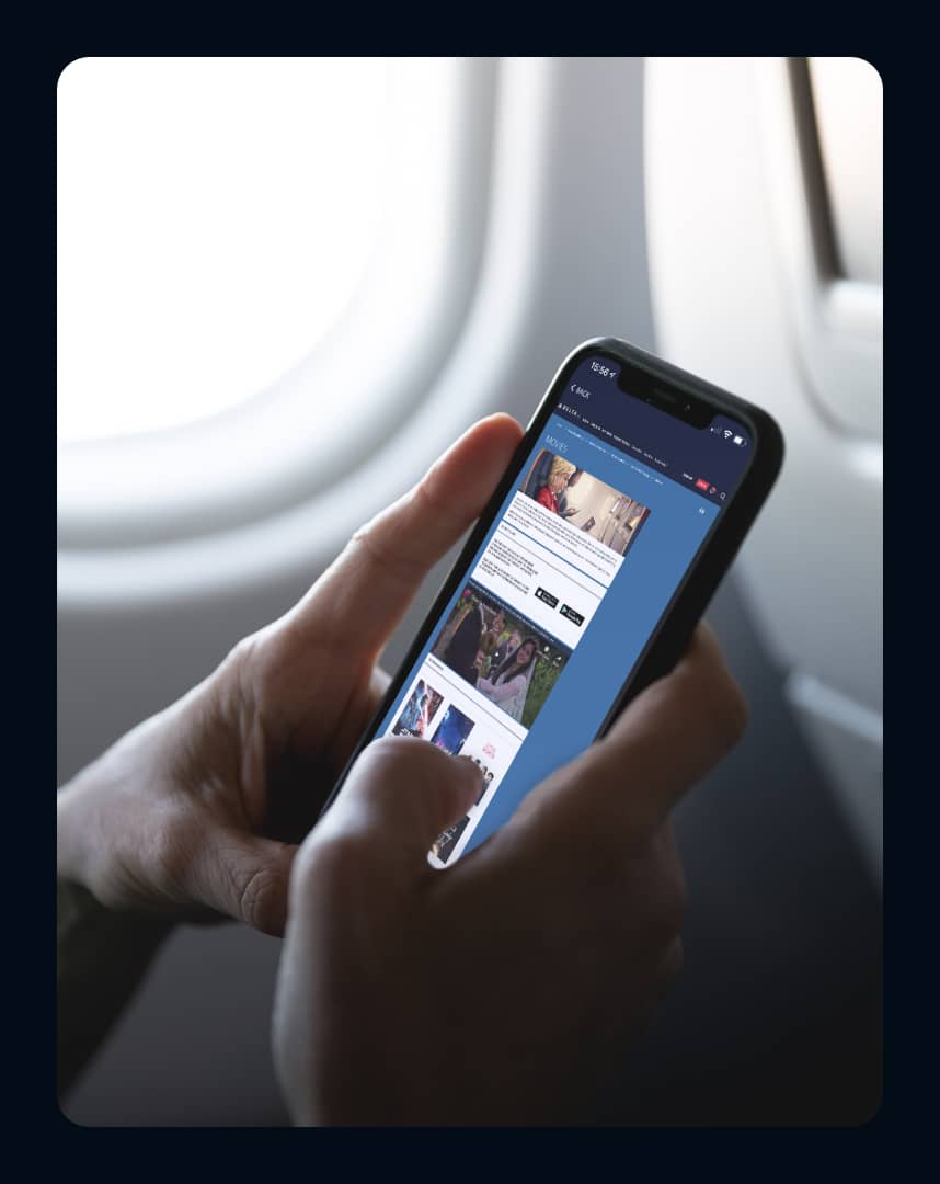
There are different pages where sign-in is required to view information, and other times, there’s a completely different app for media or live TV.

Popular Airline App Interfaces

A preview of popular airline app interfaces

The Challenge


Due to this, I wanted to create an airline app for frequent flyers to improve each part of the app where different users dealt with pain points. I kicked off the project using the following problem statement:


How might we improve airline apps to provide a seamless experience in a single app for frequent flyers?


Pausing for Clarity: This was a solo project from when I started designing.


My Role:

I was responsible ideation, research, prototyping, testing, and the design of the project.

My Solution:

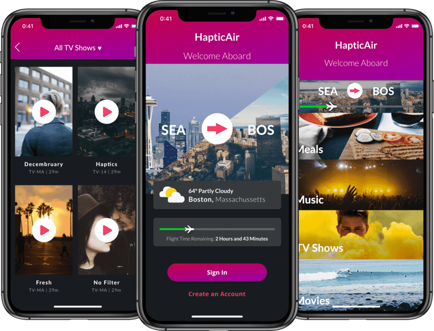
I created an interface bridging the gaps between the different in app content and options.


The Result – This is a spoiler! Click or tap here to show the result.


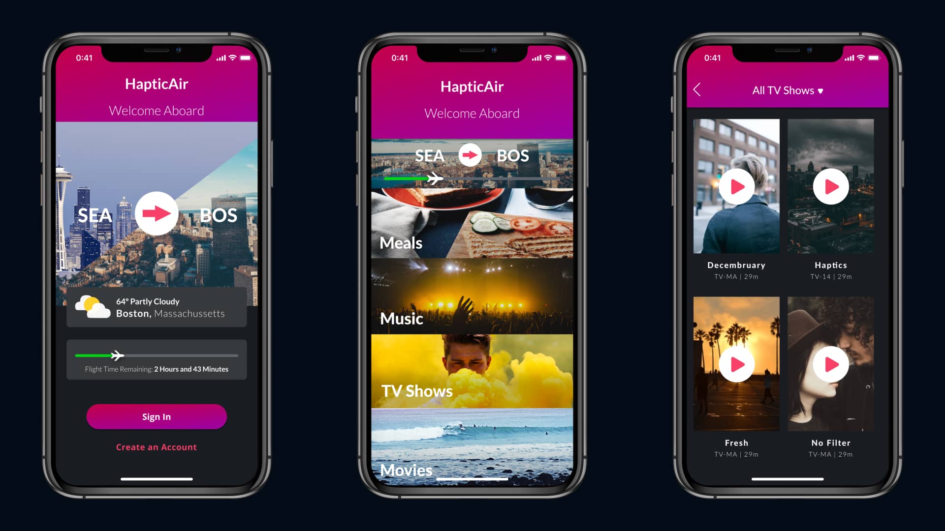
I created an interface that brought together the different parts of each app such as media, the flight tracker, and the sign-in pages. This made the app simpler for frequent flyers and allowed them to quickly and easily access the information they needed within the same app.


      Take a look at the final prototype.


1.   Researching the Problem

A Focus Group Discussion


Before diving in, I wanted to understand where travelers were struggling within the apps they used before and inflight. I began the project by sitting down with frequent flyers to understand the pain points they were dealing with.


I learned that users were struggling in two major areas:

  • Sign In: Users needed to sign in to gain access to their tickets, media, and other flight info. However, the sign-in button moved from app to app.
  • In flight content: Users have a hard time accessing media, meals, or information in the app. Usually, this content is accessed using a secondary app or a handout in flight.

"I hate how Delta makes me download a second app just to watch a show they have. How am I supposed to do that when I’m in the air?"


This helped me focus my solution on a major pain point: Frequent flyers don’t have fluidity across the apps they use.

Interviewing Megan

Interviewing Megan, a frequent flyer

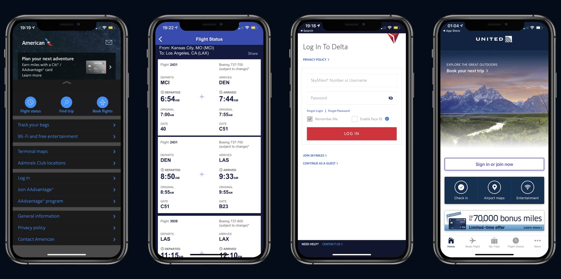
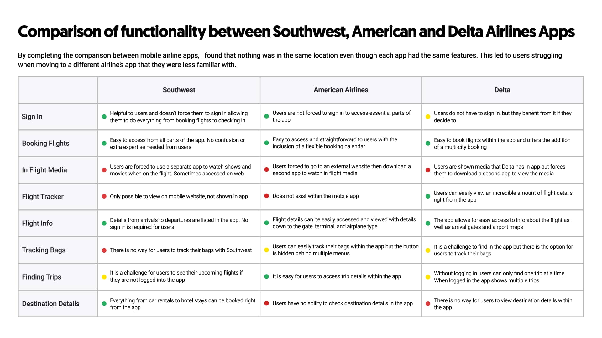
A Competitive Analysis


To better understand how I could create an app catered to frequent flyers, I analyzed similar apps that travelers relied on for flight data, details, and information, such as Delta, Southwest, and American Airlines.


When comparing other apps, I found that nothing was in the same location even though they had the same features. This led to users struggling when moving to a different app that they were less familiar with.

Competitive Analysis

Competitive Analysis of popular airline apps Southwest, American & Delta Airlines

2.   Ideation

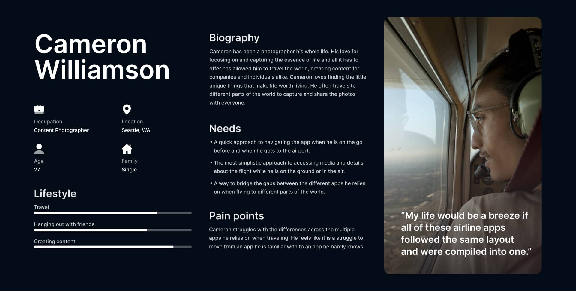
Understanding the Travelers


After honing in on the pain point I wanted to solve, I created a user persona and discussed what I could do to help frequent flyers have a better in-app experience.
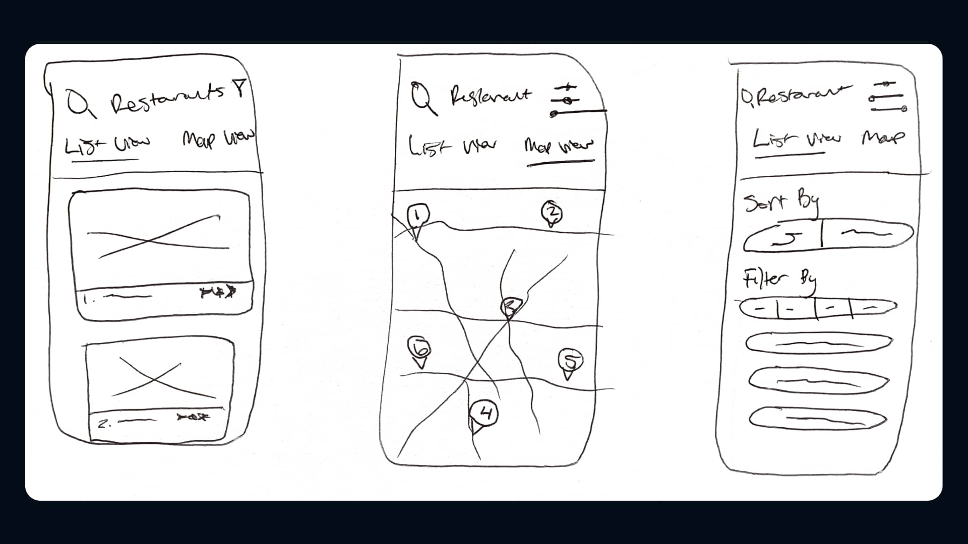
 My primary ideas were targeted at an all-around similarity with other flight apps.


The pesona helped me provide a more straightforward approach to helping frequent flyers access the content they were looking for without extensively searching or leaving the app.

User Persona

User persona for a user for Haptic Air

Sketches


After considering the different approaches to help frequent flyers find the information they needed, I made a few sketches.
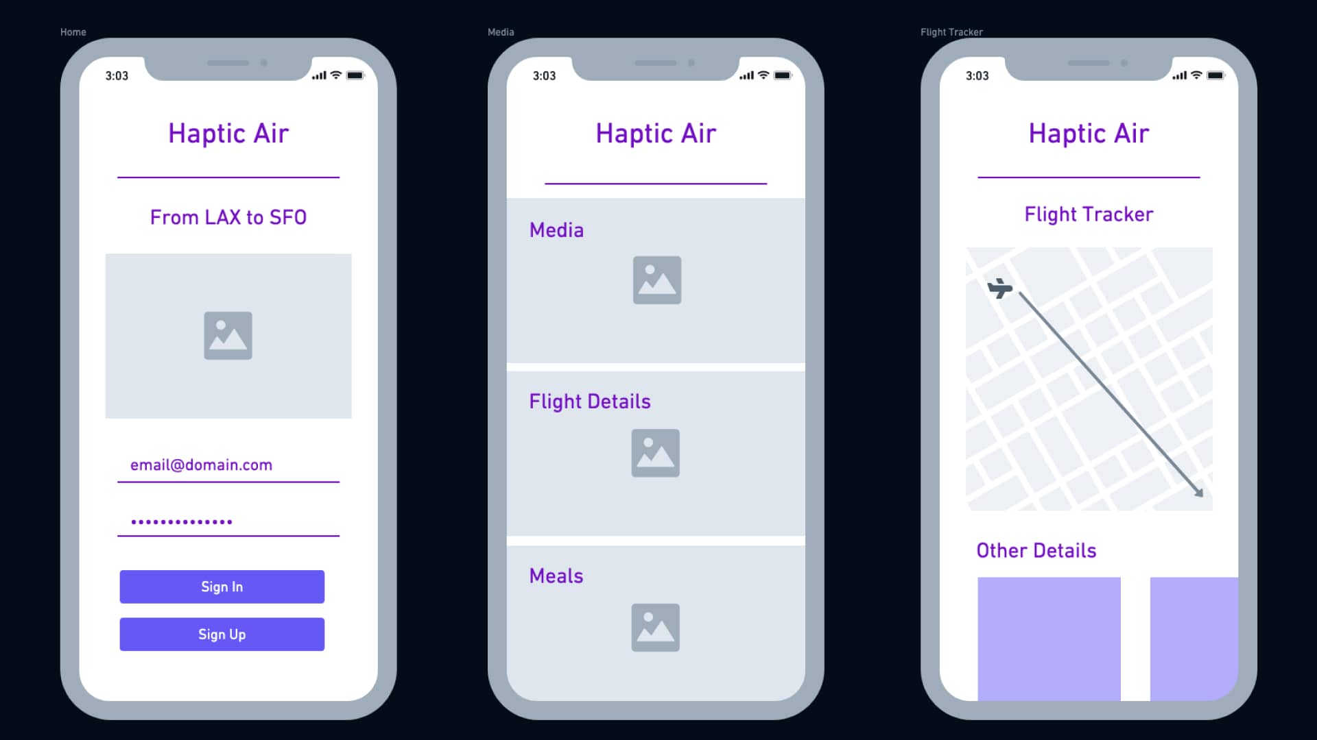
 This helped me visualize my design decisions before wireframing and testing.

Sketches

Initial sketches of an app for frequent flyers

Wireframing


Once I had a key idea of the frequent flyer’s needs, I created a few wireframes that mixed the important sections to each frequent flyer. This helped me iterate on what each section of the app could look like for testing.

Wireframes

Wireframes of the first interface

3.   Prototyping & Testing

Designing the Prototype


Using the sketches and wireframes, I designed the initial prototype for testing. I used Sketch to design and Marvel to prototype because of the ease of changing a design after testing with users.

Initial Prototype

The initial prototype for Haptic Air focused on frequent flyers' needs

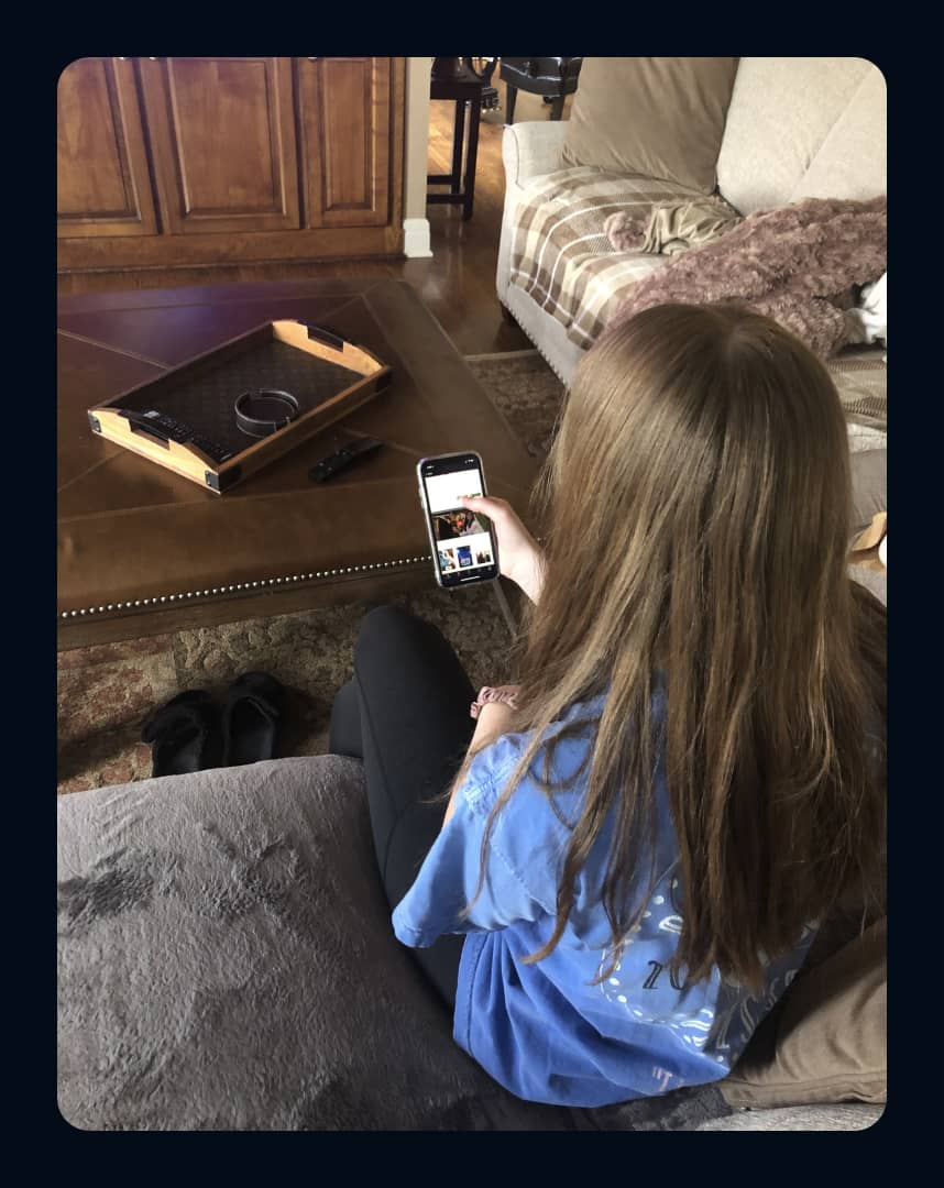
Interviewing & Testing with Users


I tested the prototype with a few different frequent flyers both from the focus group and while on the go to understand how a clearer approach to different airline apps would help them find the information they needed.


Testing helped me improve the design and gather unbiased feedback from each user that I tested with. I heard the following:


Ben

"This is nice, but I feel like something is missing. Maybe if you added the option to book a flight, that would help."


Megan

"This is much easier to navigate for me, but I’d like to see the flight tracker on more than just the home page."


4.   The Final Design

Redesigning from Feedback


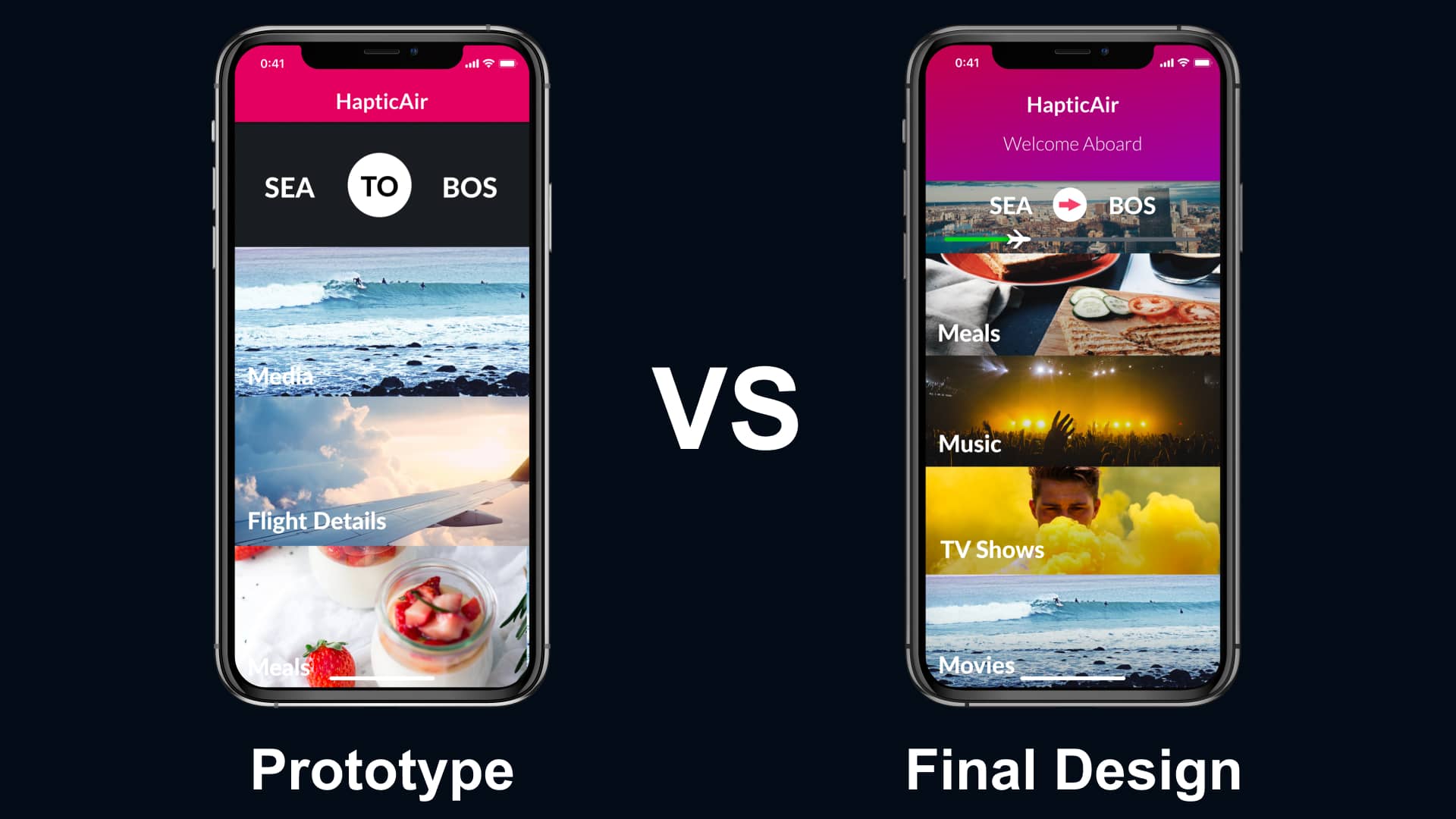
By utilizing the feedback that I gathered when testing, I understood what parts of the design needed improvement. I understood how frequent flyers would benefit from the changes and what I could do to refine the design.


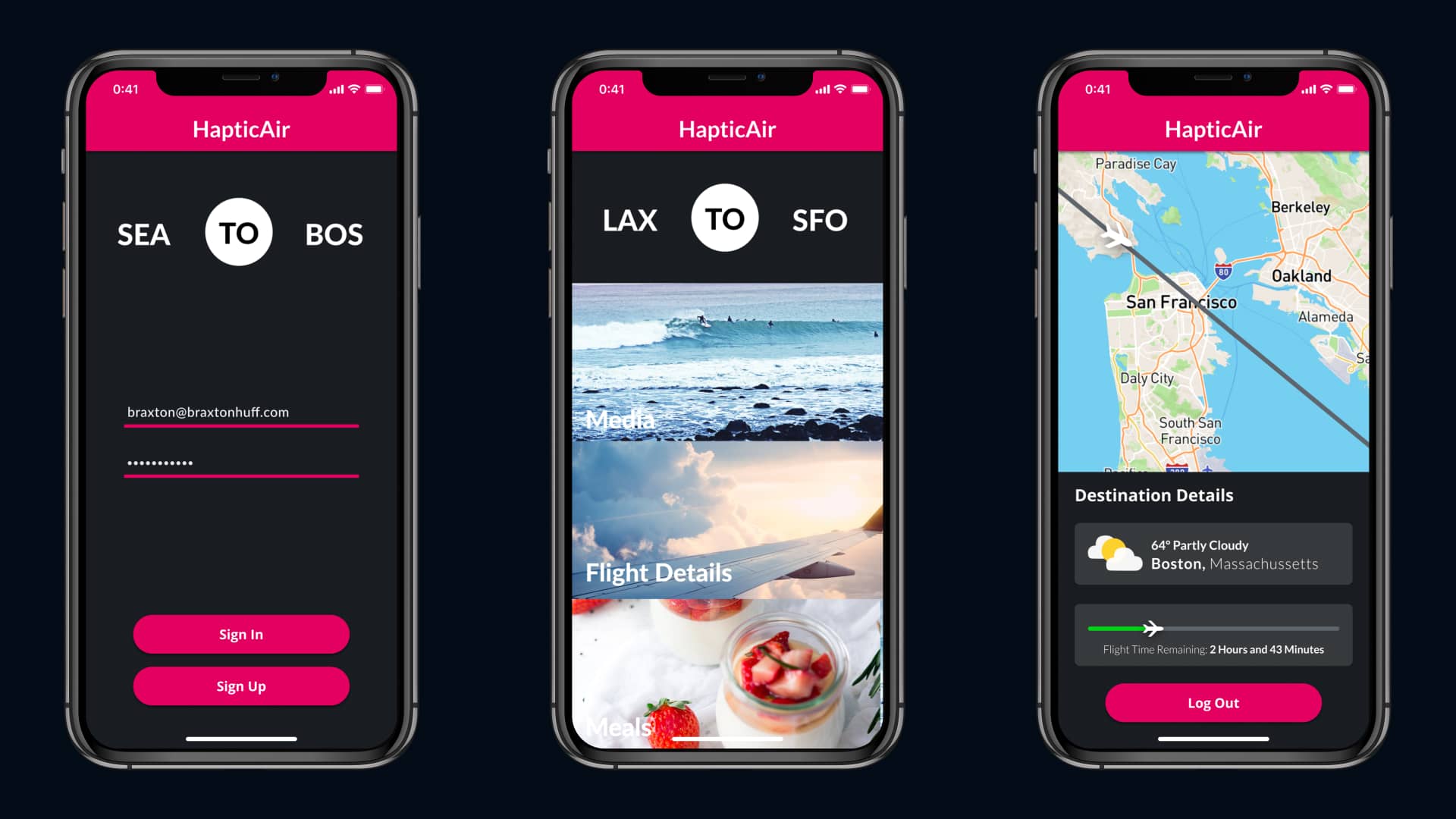
I ensured that the main page was more detailed, providing frequent flyers with the ability to book their next flight. I also added the flight tracker to the main page. My goal was to help new users clearly access the information they needed in the app quickly without continually searching.

First Prototype

The first prototype screen versus the final design
Seconds Prototype

The second prototype screen versus the final design

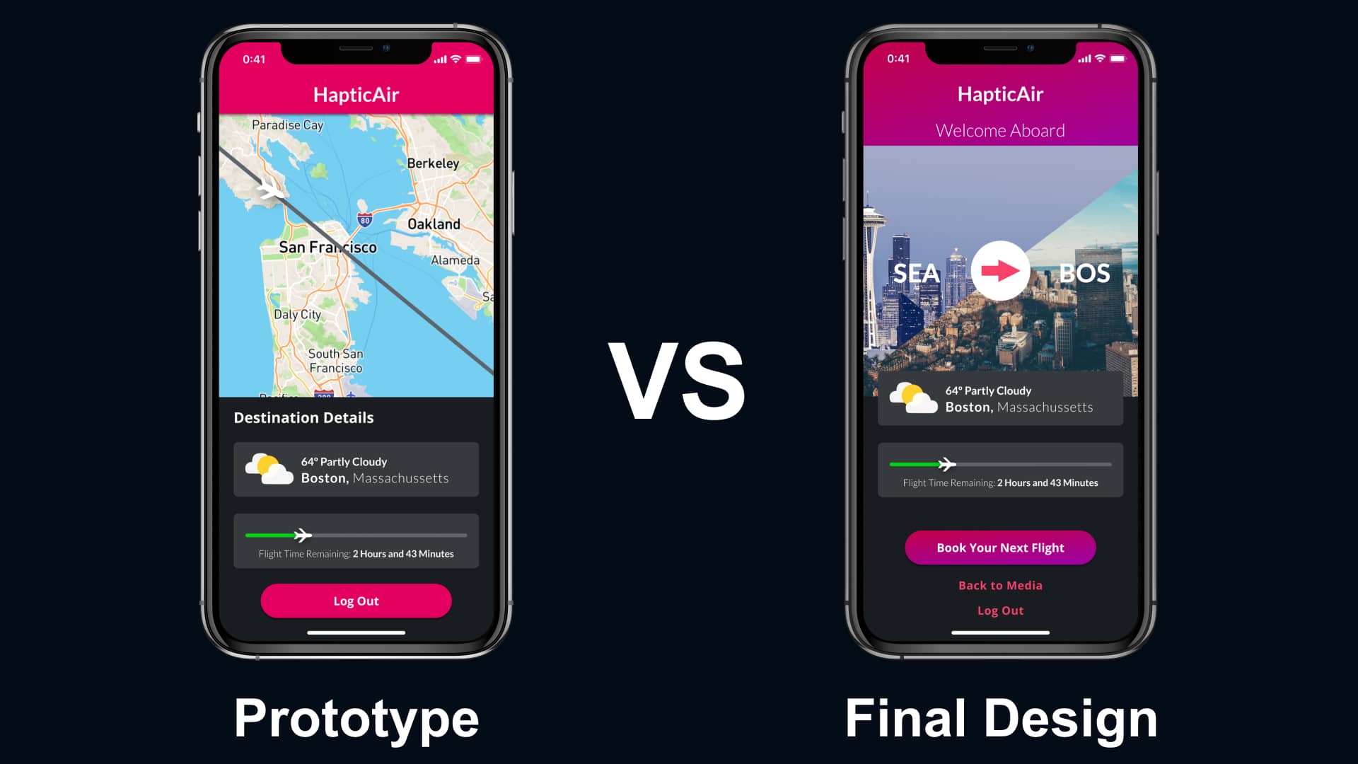
Testing the Final Design


I tested the changes with a set of users from the focus group. I learned that the new changes helped users quickly access the information they were looking for without struggle.


Through a clear home and content page, frequent flyers could better navigate the app to find all of the information they expected at their fingertips.

Final Design from Testing

Redesigned screens from testing with users
Ben

"The simplicity of booking or looking for my next flight from the home page is phenomenal. That will give me extra time to work once they’re booked.”


Megan

"I’m happy to see the flight tracker included with the media section. That makes my time in the app better.”
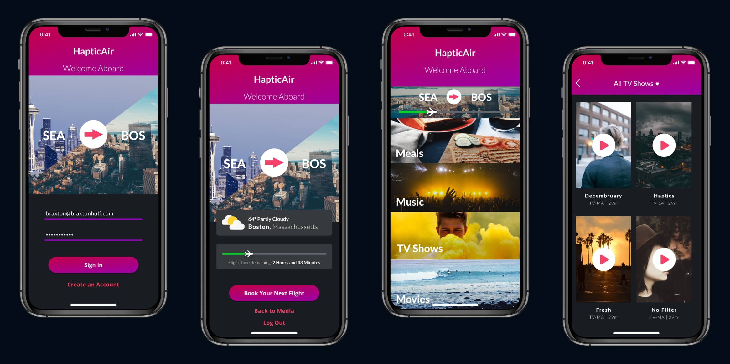

The Final Designs


To share my design with friends and family who travel often, I prototyped an example use case.


      Take a look at the final prototype.


Final Design

The final design that that bridges the gaps between the missing parts of each popular airline app

5.   Reflecting

Looking Back


This was my first time carrying out any type of interviews and designing from feedback. While it may look nice on the web, I faced plenty of struggles along the way, providing me with many valuable lessons.

What I Learned


It never hurts to dive deeper when interviewing; when talking with the focus group, I only scratched the surface.


While all turned out well, even with only scratching the surface, there could’ve been more benefit to the users who were part of the focus group and that I tested with.

Interviewing Ben on the plane

An interview with a frequent flyer on a flight to LAX

What I Would Do Differently


From the start of the project, I didn’t feel there was much of a need to expand outside of the focus group. Instead of only staying within the focus group, I would have interviewed users outside of it to get more data.


Since this project, I’ve changed my approach to incorporate more users when interviewing and testing.

Interviewing a user for a project

Interviewing a user for a project

Thanks for Reading!

I appreciate the time you’ve taken to read through my case study and get an understanding of my process. If you have any questions about Haptic Air, please reach out! I’d love to discuss it with you!


Back to All Projects