Resume

Resume

Go back to all projects

Helping Users Find the Perfect Restaurant

Redesigning Yelp's mobile web interface

First Display

~ An Overview

The Problem


In 2017 I was an 18-year-old designer set on getting an interaction design internship in the tech industry.


While searching, I saw the opportunity to intern at Uber and immediately applied. As an internship candidate at Uber, I was asked to redesign Yelp’s mobile web interface.


Users were struggling to use Yelp’s mobile web interface because of the lack of similarities to the mobile app, leading to a loss of users for a competitor’s product.

Yelp's Mobile Web Interface

An overview of Yelp's mobile web interface

The Challenge


Due to the challenges users were facing on Yelp’s mobile web interface, Uber challenged me to improve the usability of Yelp's mobile web interface to help users successfully and easily navigate, filter, and find the perfect restaurant. I kicked off my redesign by using the following problem statement:


How might we improve Yelp’s mobile web interface to help users navigate, filter, and find the perfect restaurant to eat at?


Pausing for Clarity: This was a solo project.


My Role:

I was responsible for ideation, research, prototyping, testing, and the redesign of the project.

My Solution:

I implemented filters, a quick switcher, and better search to help users find the perfect restaurant.


The Result – This is a spoiler! Click or tap here to show the result.


I redesigned the search, filters, and the list and map view switcher to help users quickly and easily find the perfect restaurant. This helped Yelp users simplify their approach when finding their preferred restaurant for the perfect meal.


Take a look at the final prototype below. — Marvel Prototype highly recommended; Figma is more detailed but notoriously slow:


1.   Researching the Problem

Secondary Research


I began the project with secondary research focusing on the major mobile websites that help users find the perfect restaurant. This helped me understand how each company successfully approached helping their users.


I learned that each company ensured their user’s needs were met through at least one of the following:

  • Simple filters: Provides assistance for users to filter between cuisine, reviews, or price quickly
  • Quick switching: Provides users with an easy way to switch from list view to map view
  • Obvious search: Prevents users from spending extra time navigating the interface to complete a search
Secondary Research

Yelp's competitor's mobile web interfaces

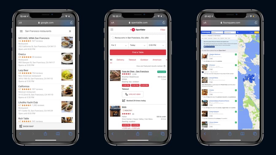
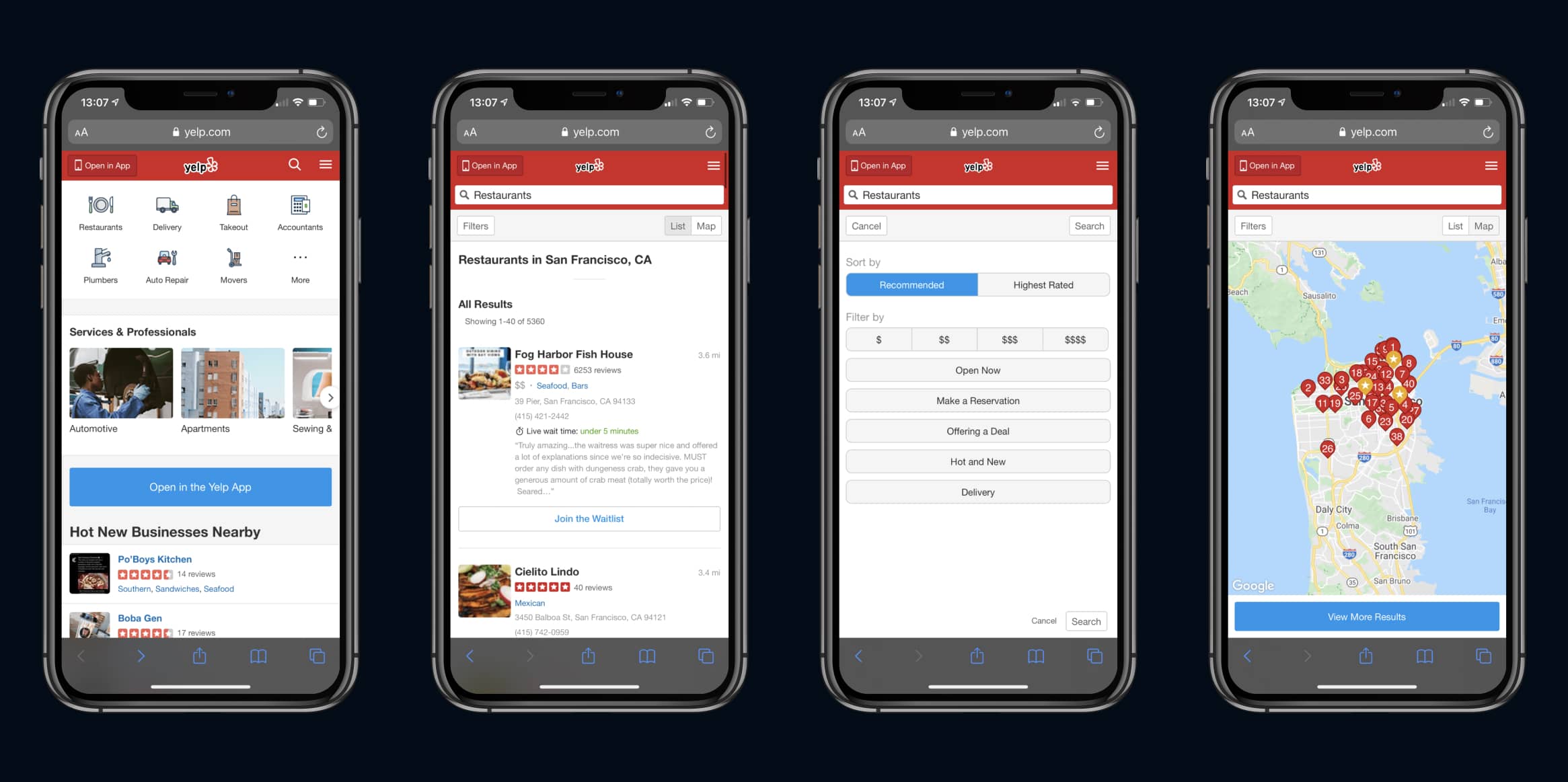
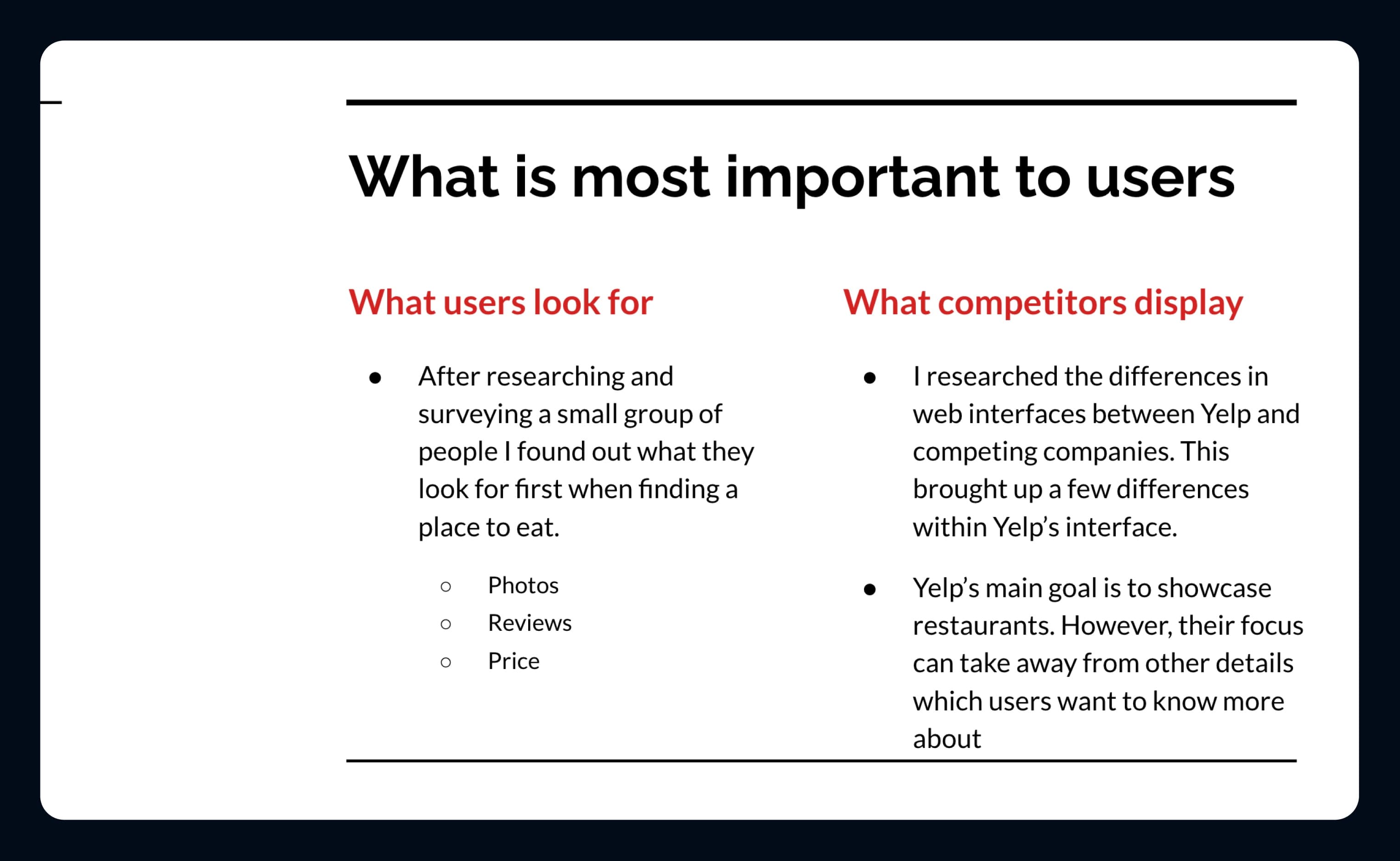
A Competitive Analysis


To better understand the differences of Yelp’s mobile web interface versus competitors, I completed a competitive analysis between Yelp’s mobile web interface and similar mobile websites such as Google Maps, OpenTable, and FourSquare.


While Yelp does well with its mobile app, the mobile website does not bring the same ease of use to their users. The options were available, but it was a challenge for users to use the website without some struggle, leading to a quicker turnover rate to find a better site.

Competitive Analysis

Competitive Analysis of Yelp's mobile web interface to competing apps Google Maps, OpenTable, & Foursquare

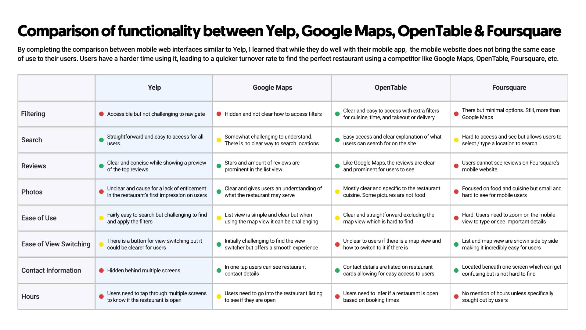
A Heuristic Evaluation


Diving deeper into the research, I completed a heuristic evaluation of the app. This helped me understand why users struggled with Yelp's website and why they would fall back on their second or third choice to find a restaurant.

Heuristic Evaluation

Heuristic evaluation showing what caused users to struggle on Yelp's mobile website

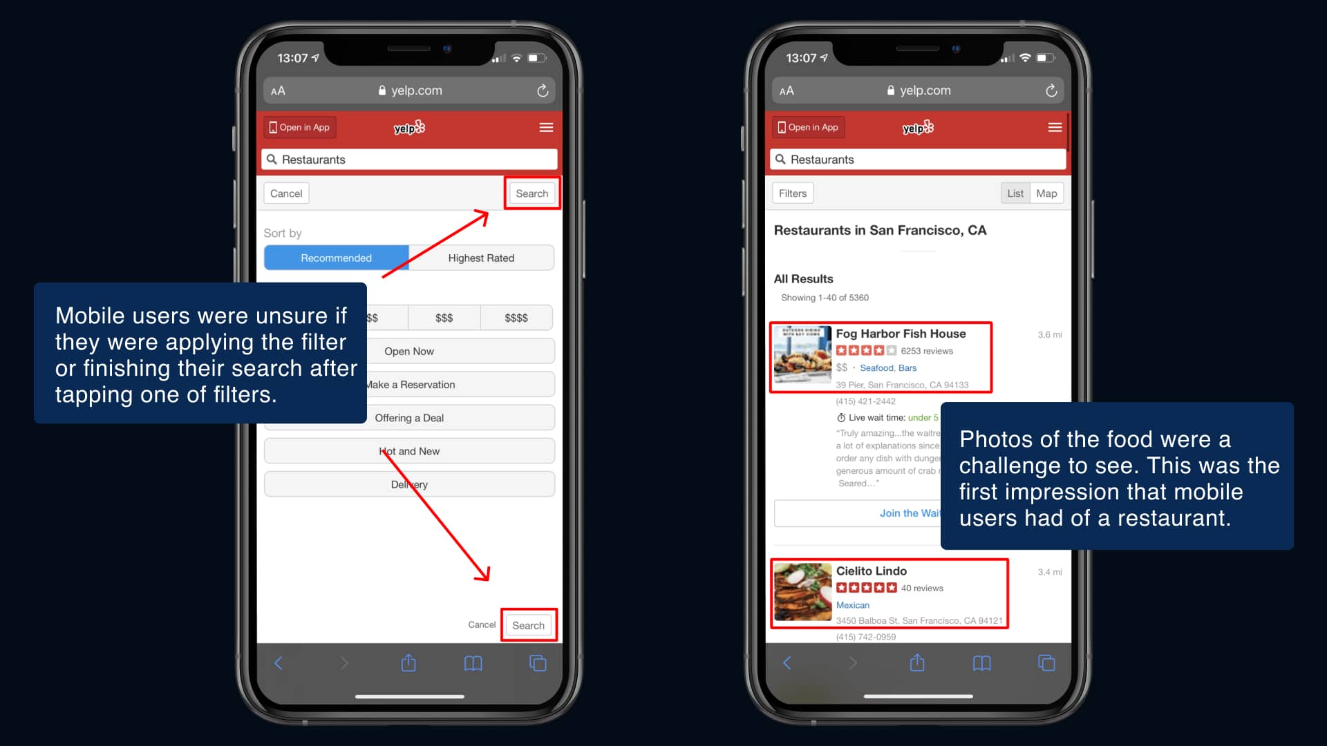
Understanding User’s Needs


To fully understand the user’s approach to Yelp’s mobile web interface, I sat down with a few users and had them complete a cognitive walkthrough, then interviewed them.


From this I learned:

  • Users didn’t know if they were applying a filter because a second search button was displayed instead of an apply button.
  • The restaurant cards did not show the restaurant hours or if it was open slowing users down when trying to find the perfect place to eat.

“I rely on these sites to suggest and help me pick what I want to eat. It’s a pain when I can’t tell if a place is open or if I make a mistake filtering.”


This helped me focus on a major pain point: Users couldn’t successfully find a restaurant they wanted to eat at without a struggle.

Noah

A cognitive walkthrough with a user

2.   Ideation

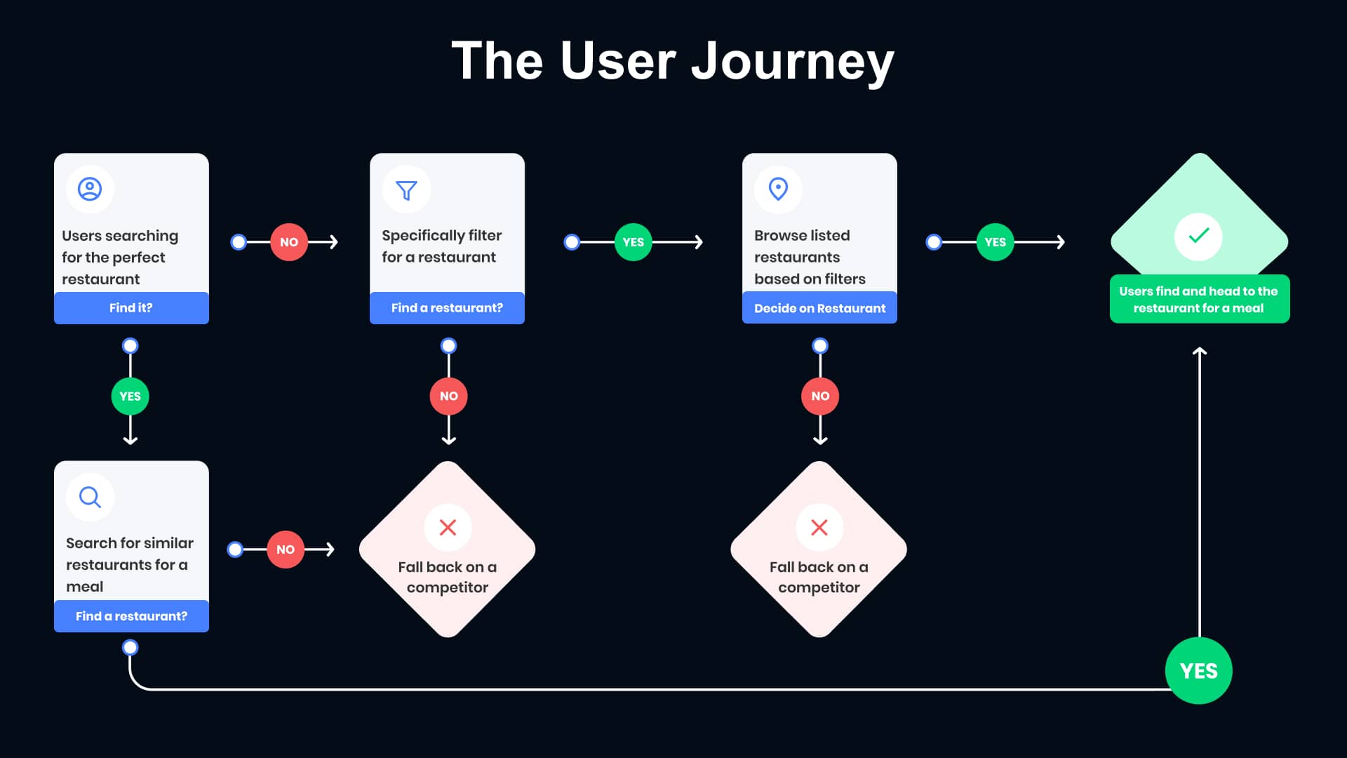
Understanding the User Journey


After honing in on the pain point I wanted to solve through the redesign, I took a look at the current user journey to pinpoint where users fell back to a competitor's web interface.


As you can see below,
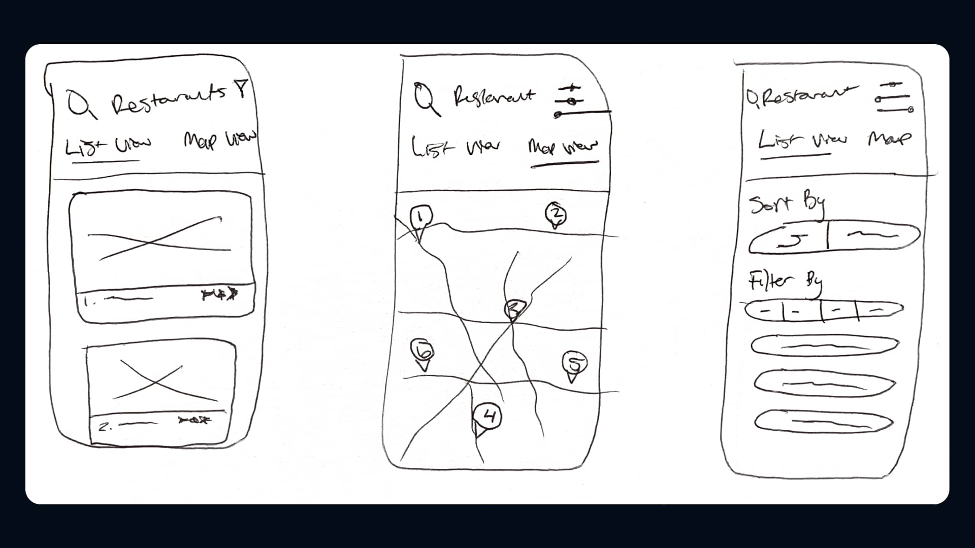
 users struggled in multiple areas because of the language of the buttons and lack of details on cards causing them to fall back on second or third alternatives to find a restaurant.

User Journey

The User Journey of Yelp's mobile web interface

Sketches


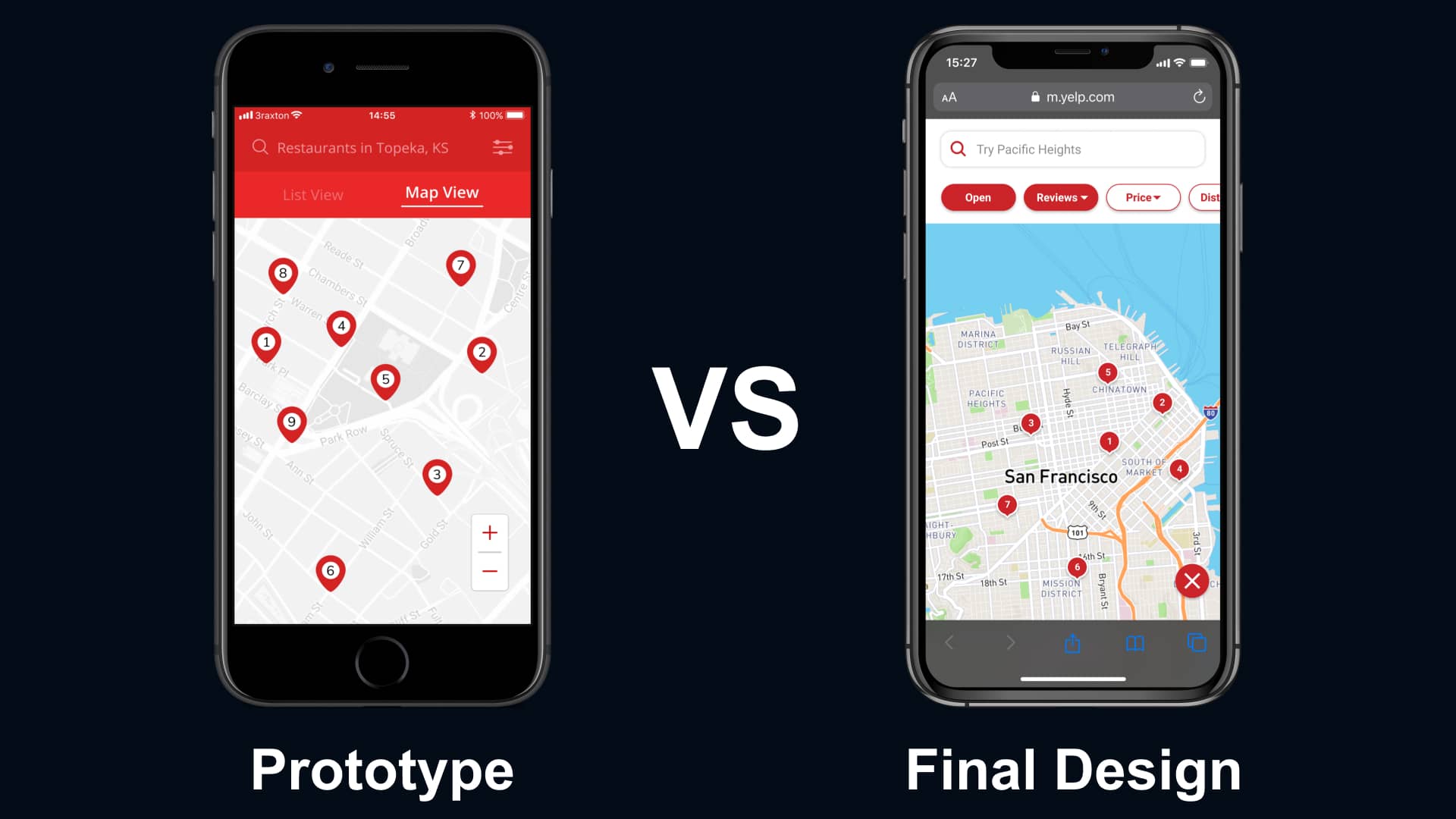
While reviewing the mobile web interface, I drew up a few sketches of what the mobile redesign might look like.
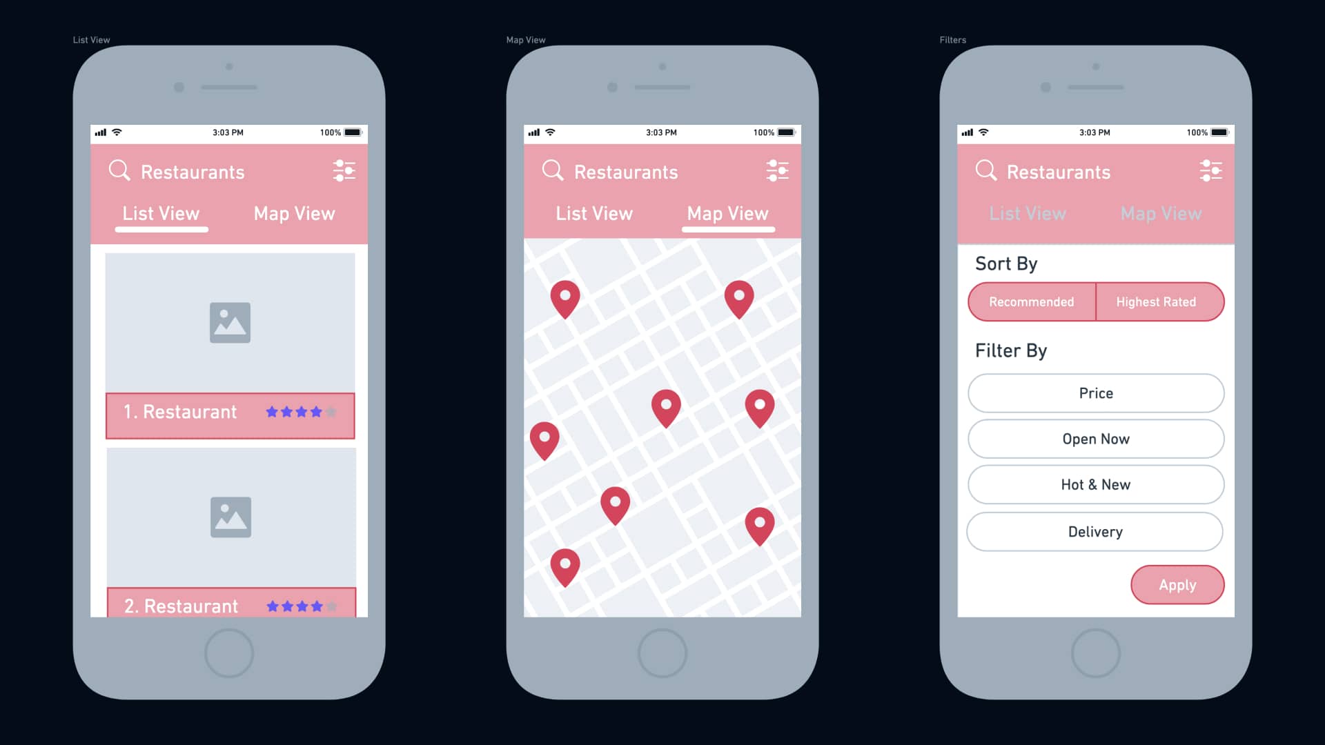
 This helped me to visualize my design decisions before wireframing and testing.

Sketches

Initial sketches of the interface redesign

Wireframing


Once I had a key idea of the user’s needs and what the new interface could look like, I wireframed it. This helped me expand on the look of Yelp’s mobile web interface and ensure that it was clear to users when prototyping and testing.

First Wireframe

Wireframes of the first interface

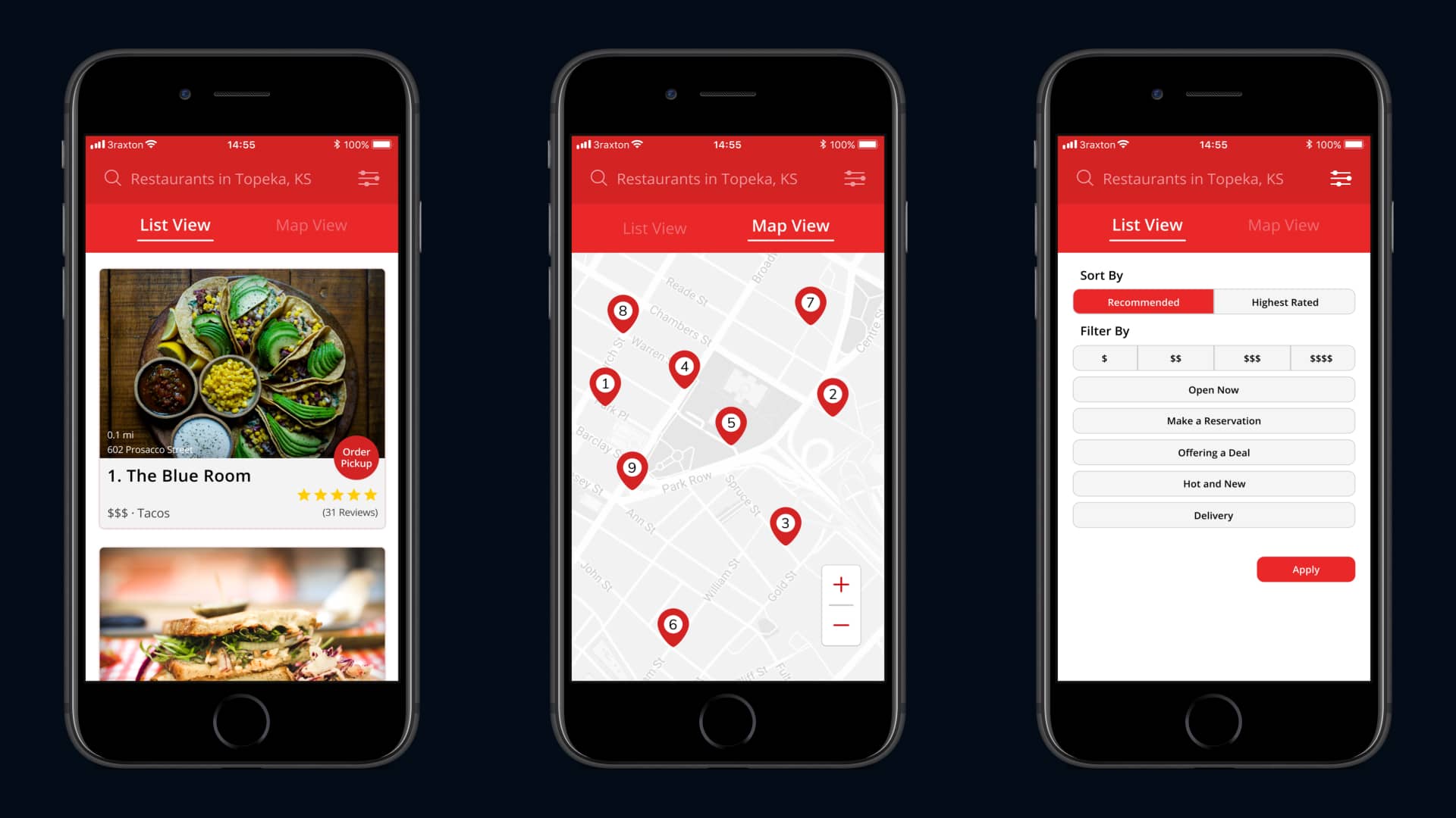
3.   Prototyping & Testing

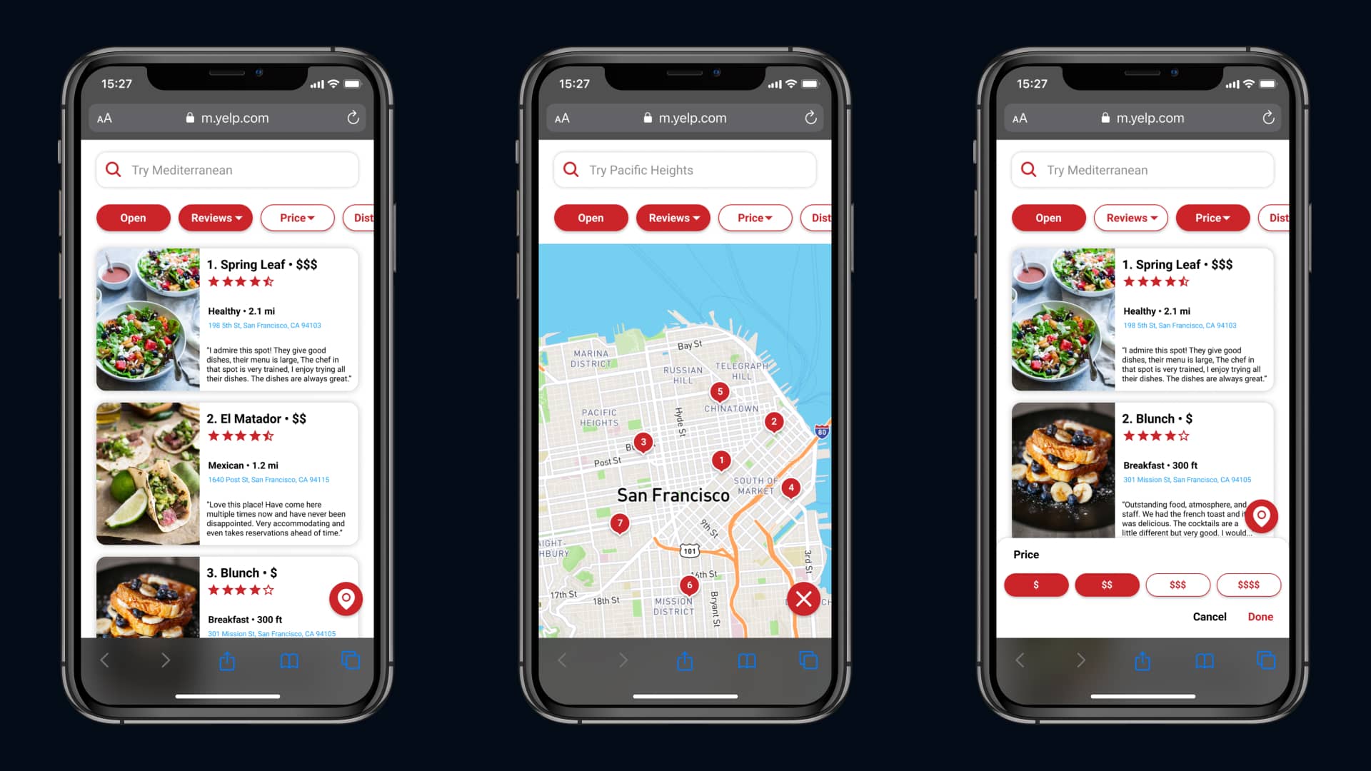
Designing the Prototype


Using the sketches and wireframes, I designed the initial prototype for testing. I used Figma to design and prototype because of the simplicity of making changes and sharing the prototype when testing.

Initial Prototype

The initial prototype for the redesign of Yelp's mobile web interface

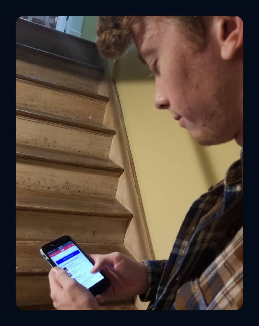
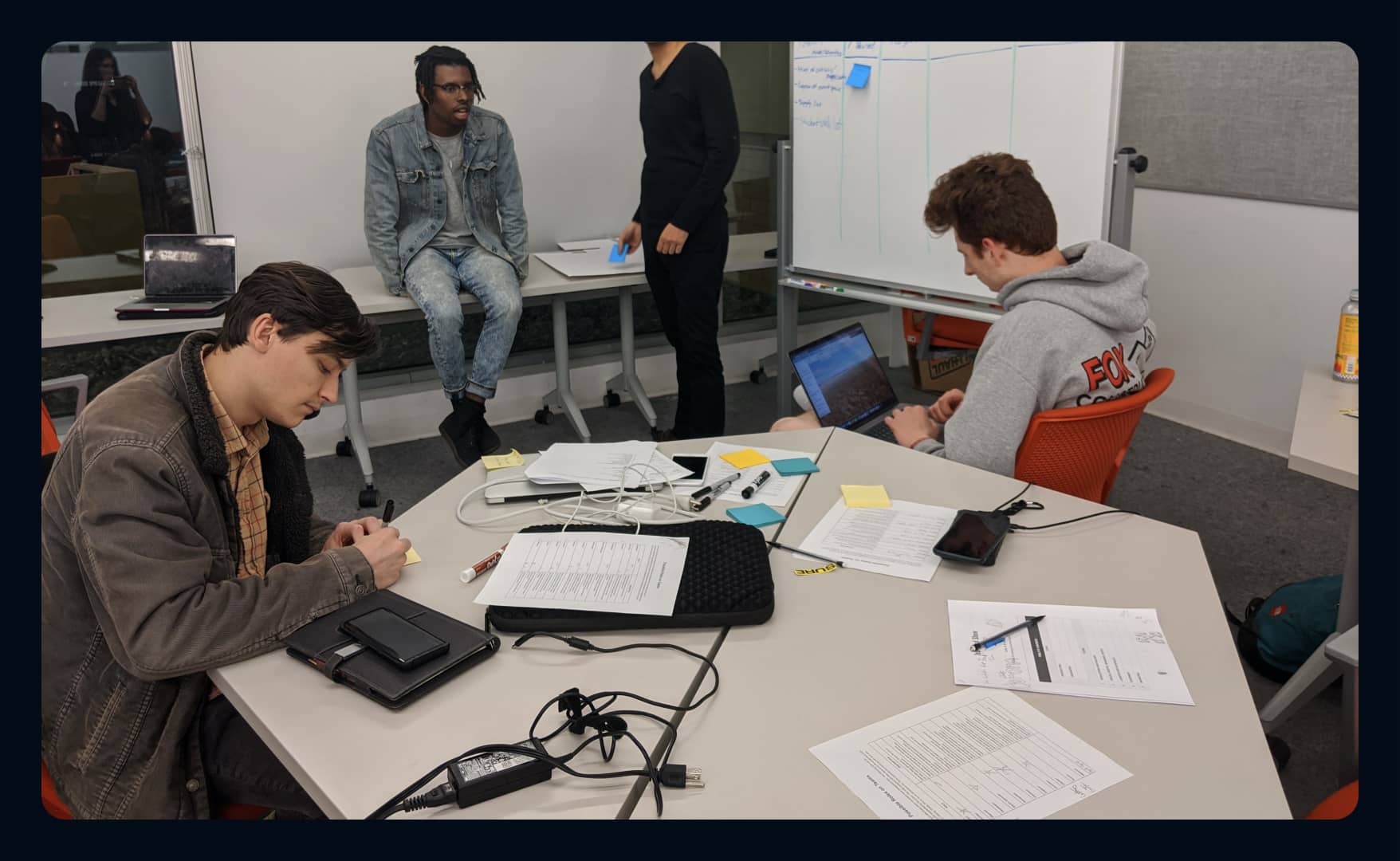
Interviewing & Testing with Users


I tested my prototype with Yelp users to understand how an easier search and more detailed filters could help them navigate, filter, and find the perfect restaurant.


Testing helped me improve the prototype’s initial design and gather unbiased feedback from each user that I tested with. I heard the following from users:


Noah

"I like it, but I had no idea the search bar and filters were there and missed them. I also wish the filters were buttons instead of blocking the screen."


Connor

"I hate how there are only one and a half pictures per scroll. It's hard for me to consider using this if I want to see the 20th restaurant down."


Ethan

"It’s so hard to see the prices and the amount of reviews. I wish they were bigger so I could actually see what they say."
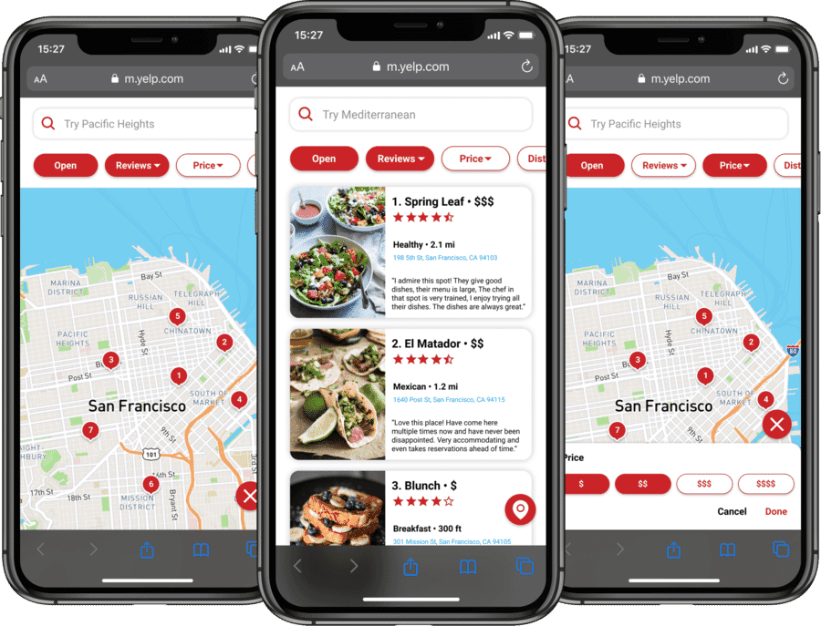
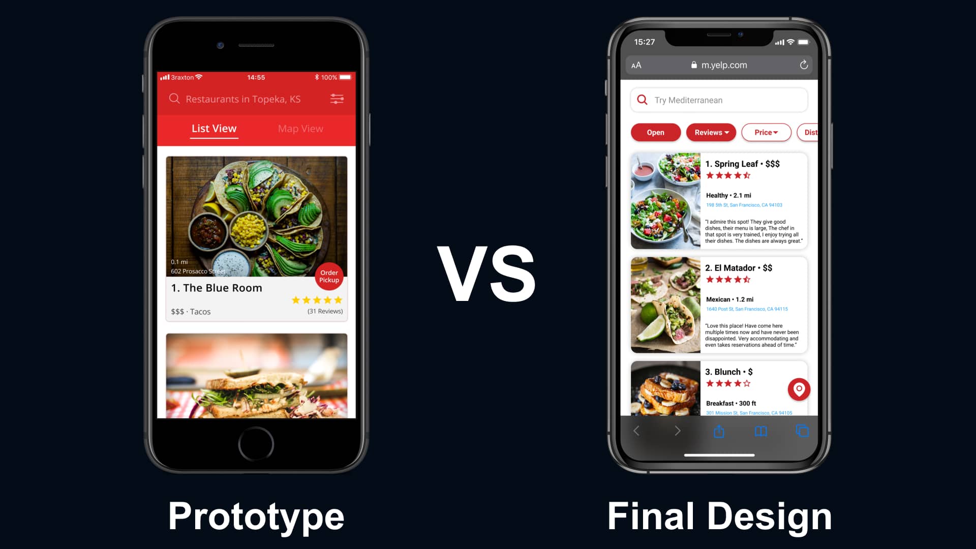

4.   The Final Design

Redesigning from Feedback


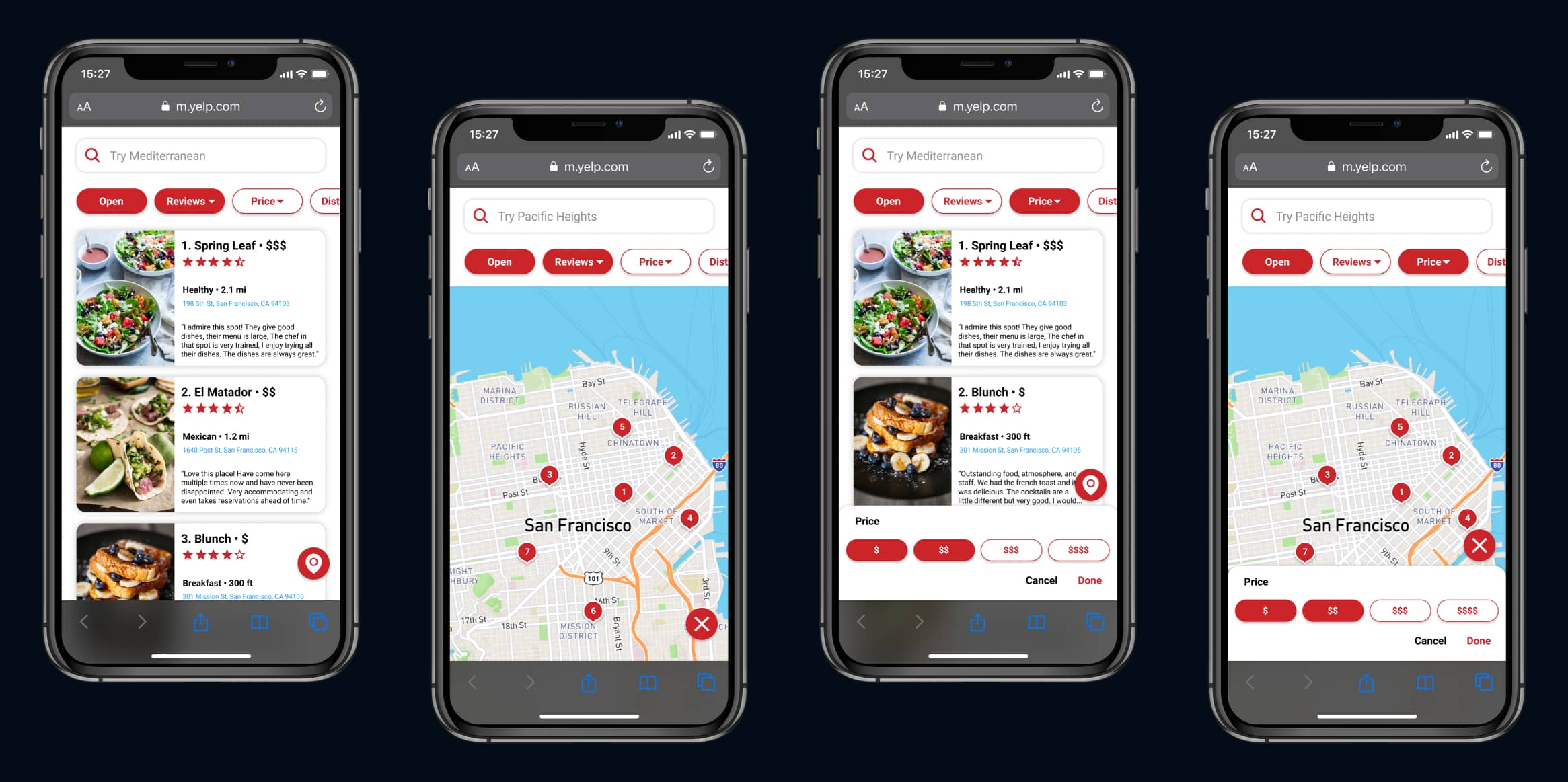
From the feedback and quotes gathered when testing the prototype, I knew that I needed to refine the design. I understood where users were still struggling and what could be done to improve their experience with Yelp’s mobile web interface.


I created a more prominent search with easier access to filters and improved the restaurant card size, as well as the restaurant location. My goal was to provide users with a quicker and easier way to navigate, filter, and find the perfect restaurant to eat at with an improved visual hierarchy.

First Prototype

The first prototype screen versus the final design
Seconds Prototype

The second prototype screen versus the final design

Testing the Final Design


I tested the changes with the same set of users and learned that the new design helped them easily find the perfect restaurant.


Users could quickly and successfully navigate, filter, and find restaurants on the mobile web redesign instead of dealing with the struggle of searching and filtering as they did with the original interface.

Final Design from Testing

Redesigned screens from testing with users
Noah

"Finally, something that feels right and native! I wish that this was what the actual web interface was like; it would make my life so much easier.”


Ethan

“This is incredibly clear and feels like it should have been this way from the start. Everything I use on other websites is here and quickly accessible.”


The Final Designs


Before wrapping up the project, I prototyped my redesign to share with the recruiters and designers at Uber so they could better understand my process.


Take a look at the final prototype below. — Marvel Prototype highly recommended; Figma is more detailed but notoriously slow:


Final Design

The final design that makes it easier for users to navigate, filter, and find the perfect restaurant to eat at

5.   Reflecting

Looking Back


Having the opportunity to complete a design challenge from a tech company was incredible. I had the chance to put what I’d learned to the test and improve the usability of a product that people use daily. By focusing on users' needs and uncovering their pain points, I better understood each step's importance in the design process.

Interviewing Connor

An interview with a user of Yelp's mobile web interface

What I Learned


This was the first time I completed a design exercise leading to a lack of consistency and communication in my final case study. There was too much text causing recruiters to be overwhelmed and almost no mention of my process. From this, I learned the importance of refining a case study before the deadline and properly sharing it with the company's recruiters and designers.


I don't know everything. During this exercise, I didn’t reach out to others for design feedback aside from users. I thought that because I was designing for the users, I knew what they needed ... I don’t.


This experience taught me about the importance of discussing design decisions with others and keeping users in mind each step of the way.

A slide I sent to Uber

One of the slides that I shared with Uber's recruiters and designers

What I Would Do Differently


This design exercise didn’t come without a few struggles along the way. Initially, I struggled to understand the user's pain points, causing me to struggle when refining the design because I felt like I didn’t know what to ask.


This helped to improve my process for future projects where I didn’t worry about the questions asked but instead about the answers received. Since this project, I ensure that I ask multiple types of questions to help prompt users for more in-depth details about the pain points they’re facing.

Collaborating with other designers

Collaborating with other designers since the Yelp project

Thanks for Reading!

I appreciate the time you’ve taken to read through my case study and get an understanding of my process. If you have any questions about my Yelp Redesign for Uber, please reach out! I’d love to discuss it with you!


Back to All Projects