Simplifying Features for New Users
Improving user retention in the Sporting Kansas City app
No time to read? Click or tap here for a TL;DR
~ An Overview
The Problem
FanThreeSixty offers data-driven solutions to create the best possible experience throughout every aspect of a sports fan's journey.
The Challenge
Due to this, I was asked to be part of a summer associate team focused on creating a solution to improve user engagement and preventing new user dropoff.
How might we improve user retention by enticing Sporting Kansas City fans to use the app during and after soccer matches?
Pausing for Clarity
My Role:
I was responsible for the initial ideation, research, prototyping, testing, and the design of the project.
The Team's Solution:
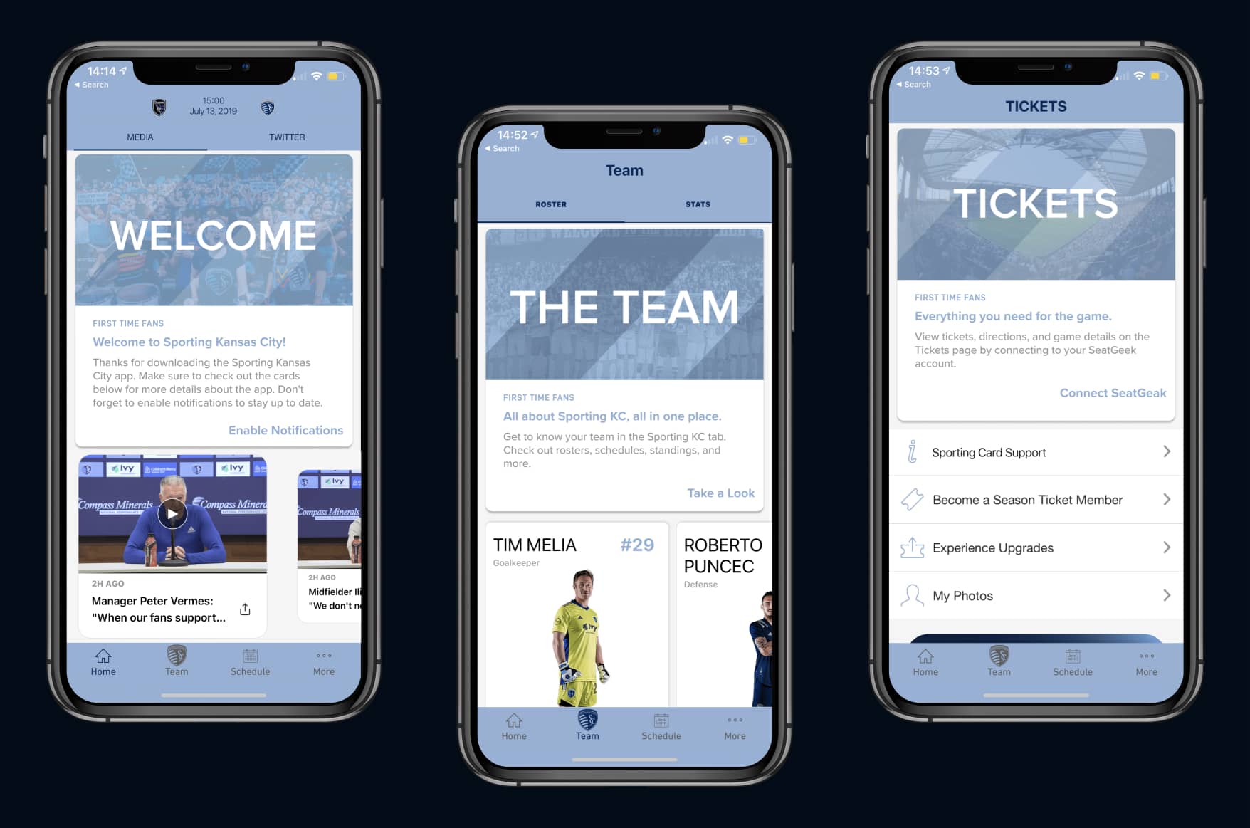
We implemented targeted calls to action on the home screen in the Sporting Kansas City app.
The Result – This is a spoiler! Click or tap here to show the result.
1. Researching the Problem
A Cognitive Walkthrough
Before diving in, we wanted to understand how fans used the Sporting Kansas City app.
We learned that new users were dropping off of the app for two main reasons:
- New users couldn’t find what they wanted to see because of the multiple avenues of content
- Most new users were primarily focused on matchup stats not scanning tickets or ordering food
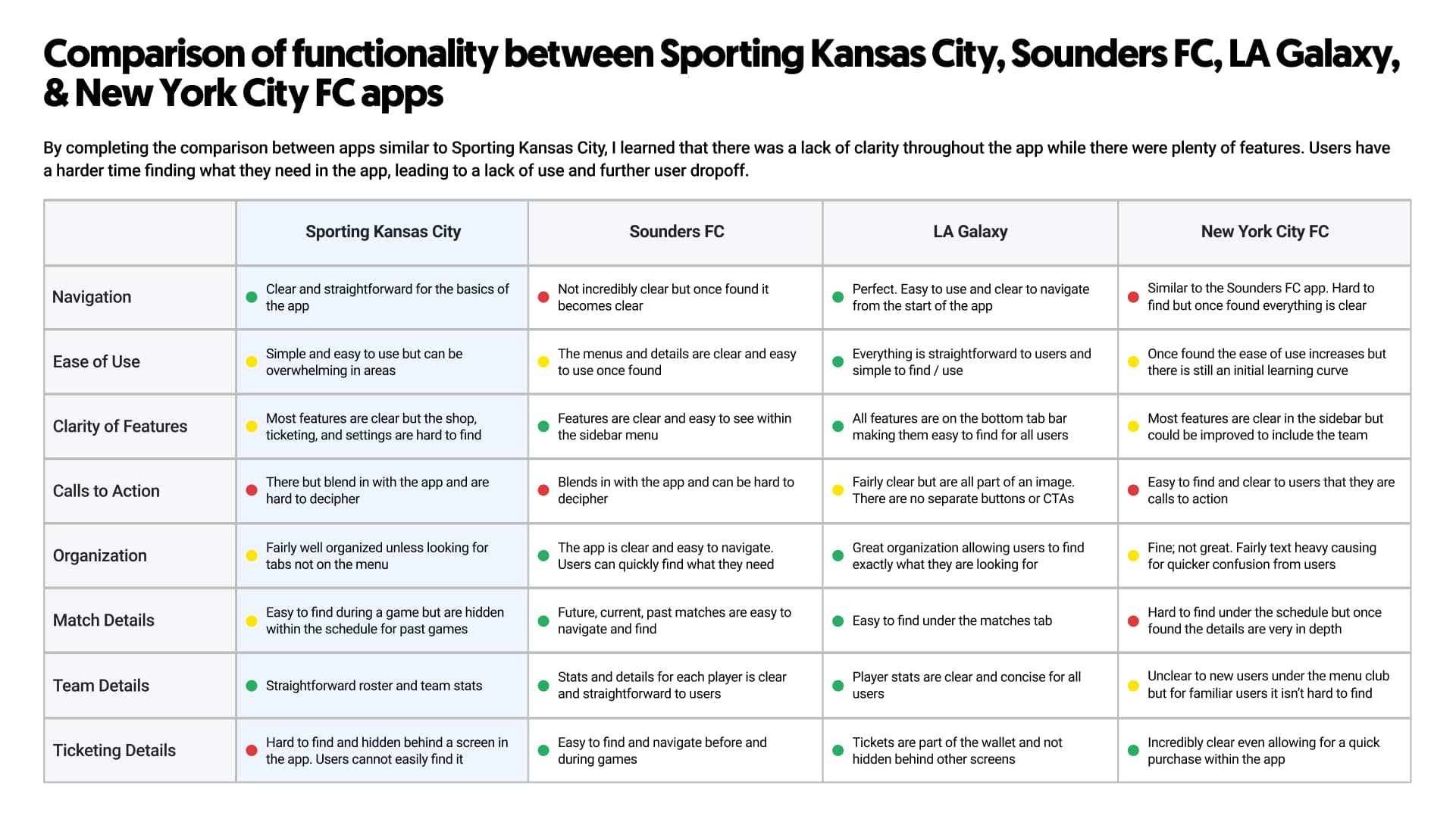
A Competitive Analysis
To better understand how we could improve the app,
We found that in comparison to other apps, the Sporting Kansas City app was a bit challenging to use.
2. Ideation
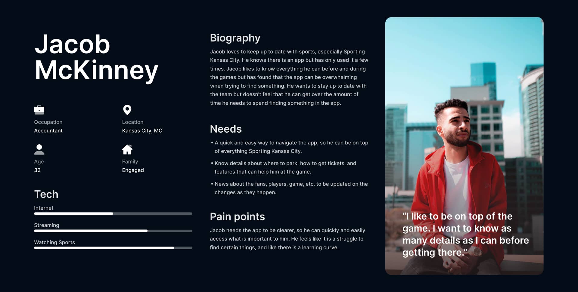
Understanding the Fans
After honing in on the pain point we wanted to solve,
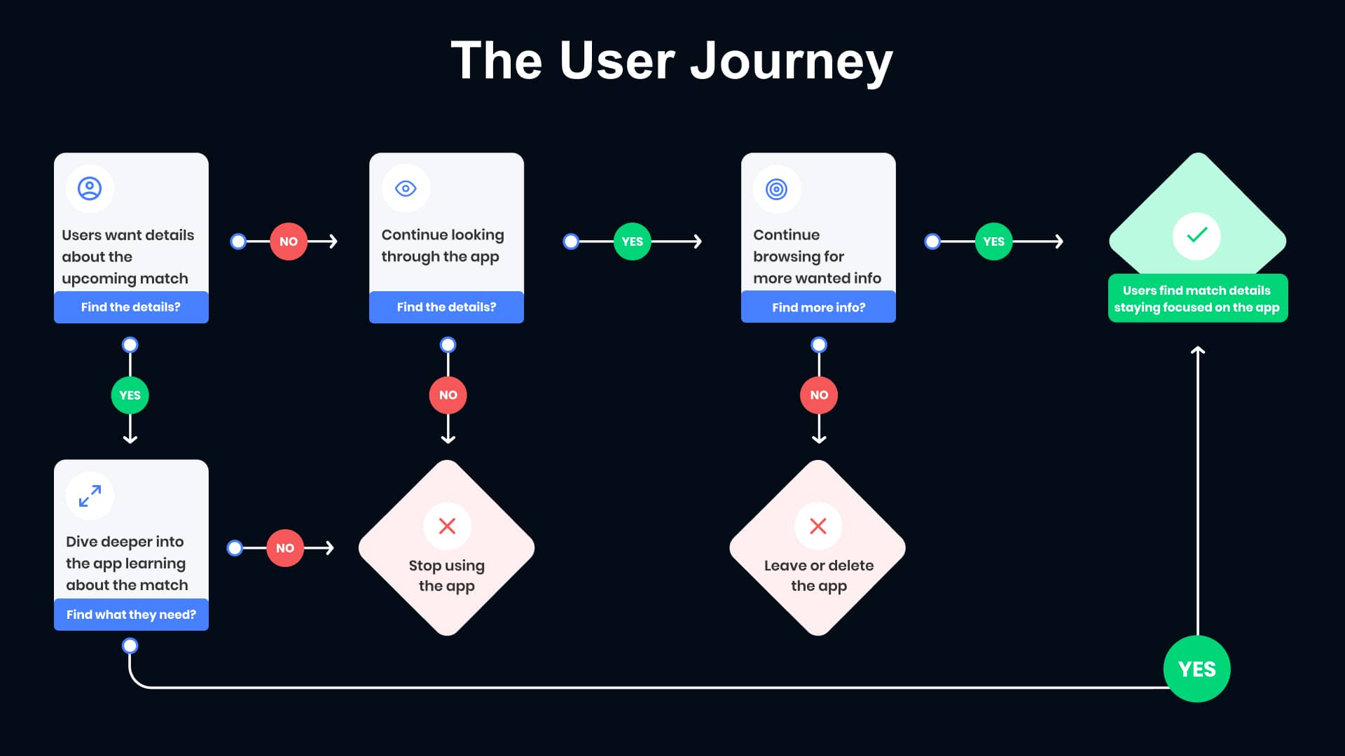
Dissecting the User Journey
We looked at the Sporting Kansas City app's current user journey to understand why new users were missing key aspects of the app.
As you can see below,
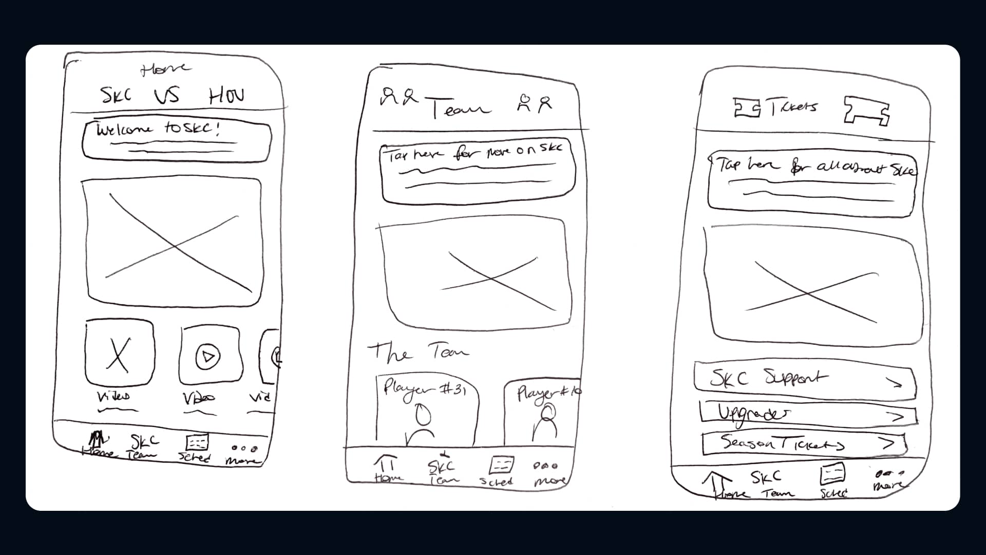
Sketches
The team and I discussed the potential approaches for onboarding new fans. I made a few sketches of the app’s home section.
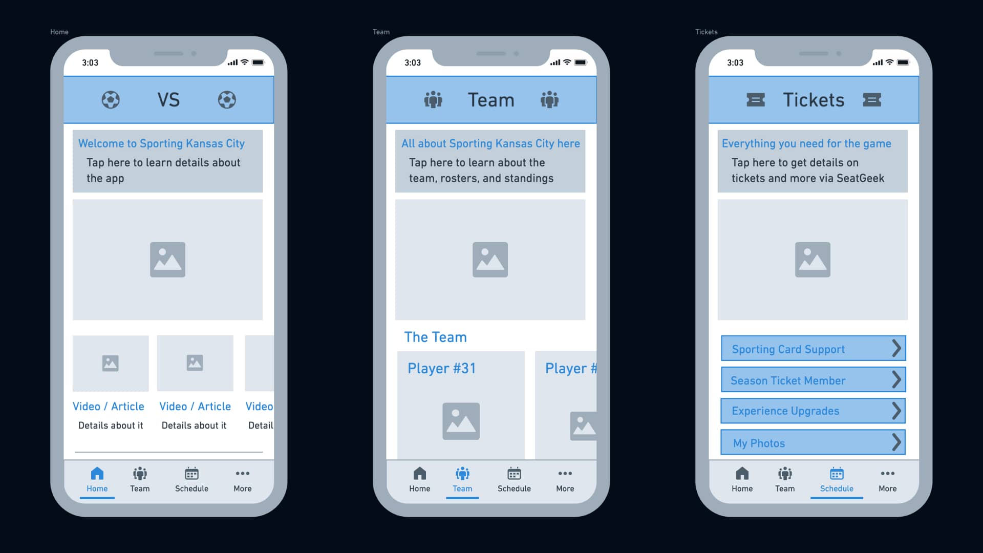
Wireframing
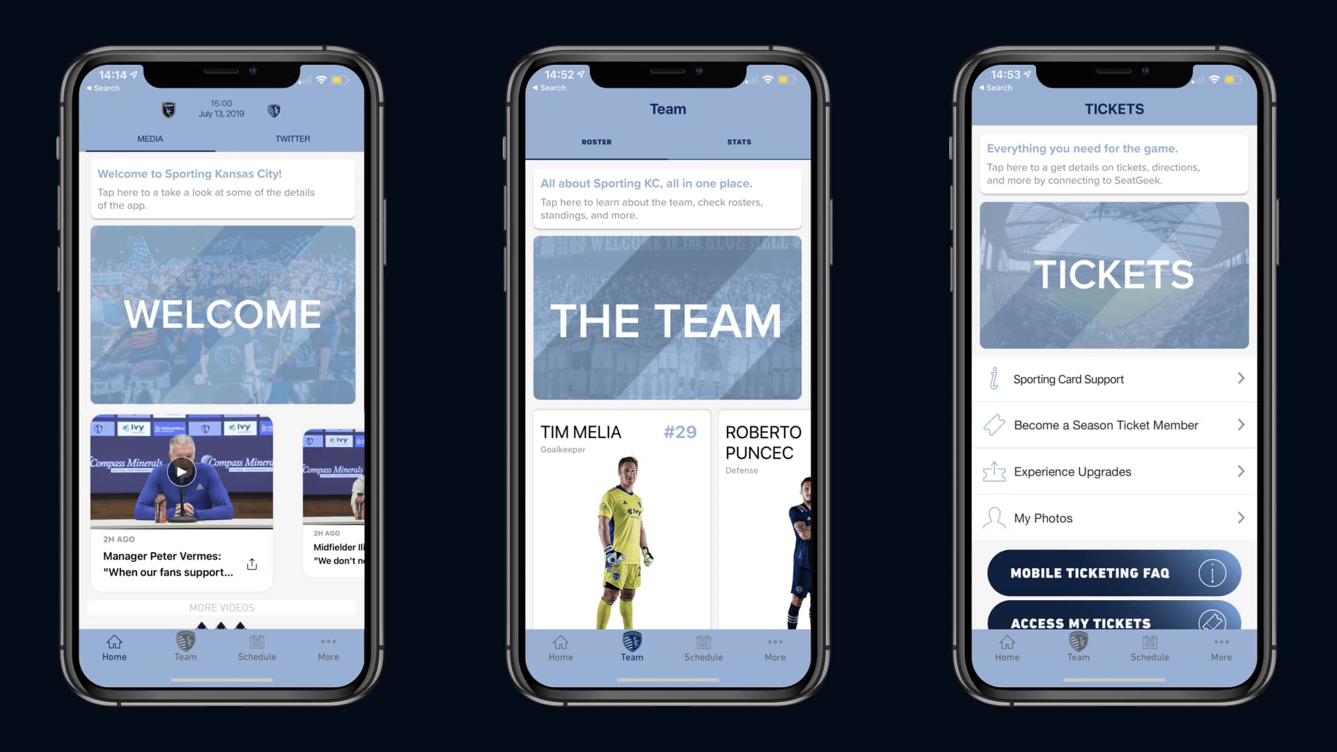
Once we had a key idea of our users and the best approach for the app, I created a few wireframes showing what targeted communication cards could look like.
3. Prototyping & Testing
Designing the Prototype
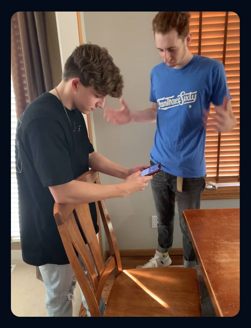
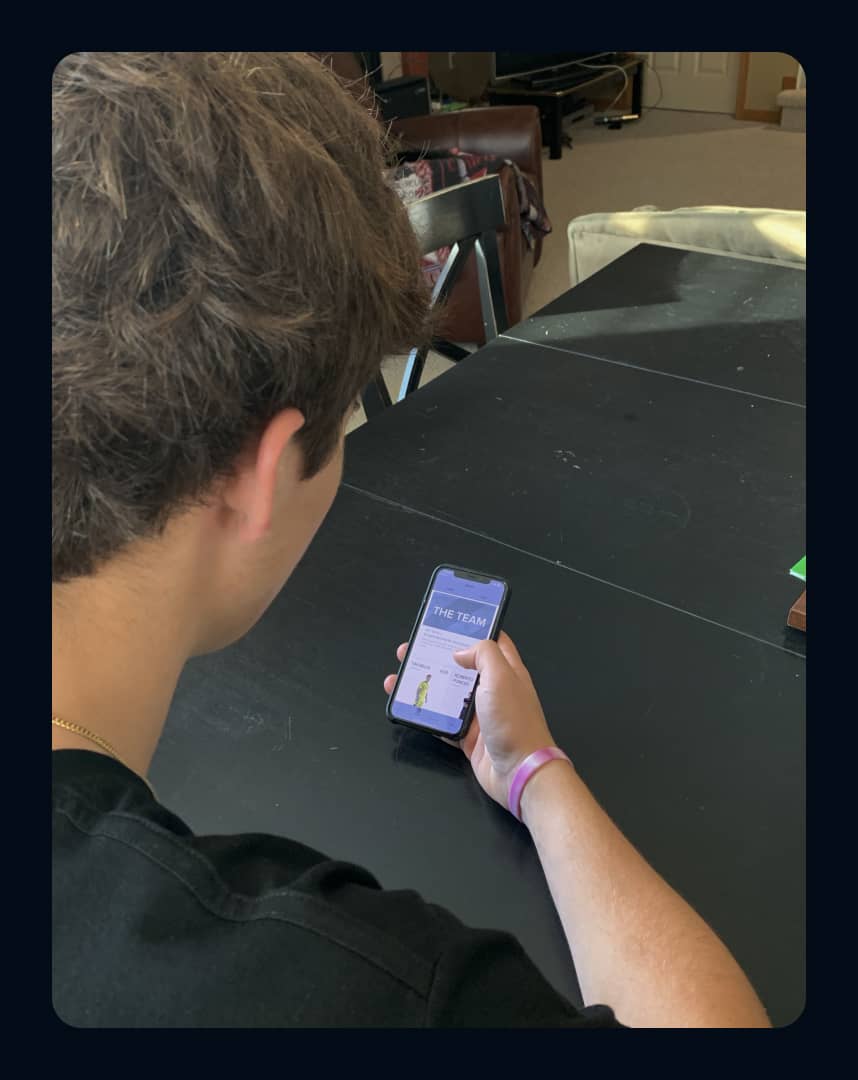
Interviewing & Testing with Users
The team and I tested our prototype with newer users of the Sporting Kansas City app to understand how targeted communication cards would help them understand and become familiar with the app’s content.

"I’m not sure where I need to tap and how it makes the app any better. I wish there was a way to know where it would take me before tapping."

"I like how it shows me what features are in the app and explains them. It’d be nice to see more of an explanation for each area, though."
4. The Final Design
Redesigning from Feedback
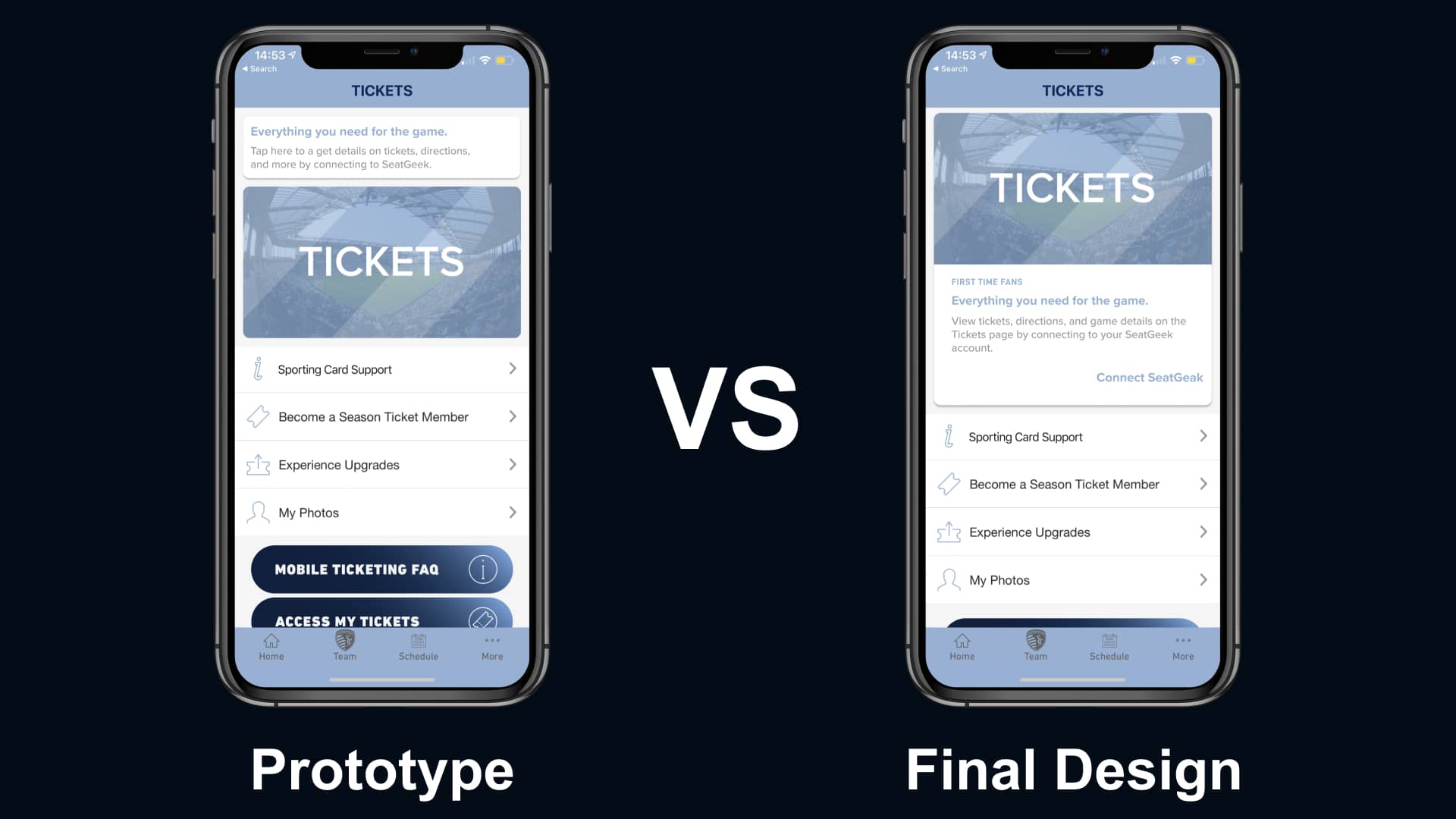
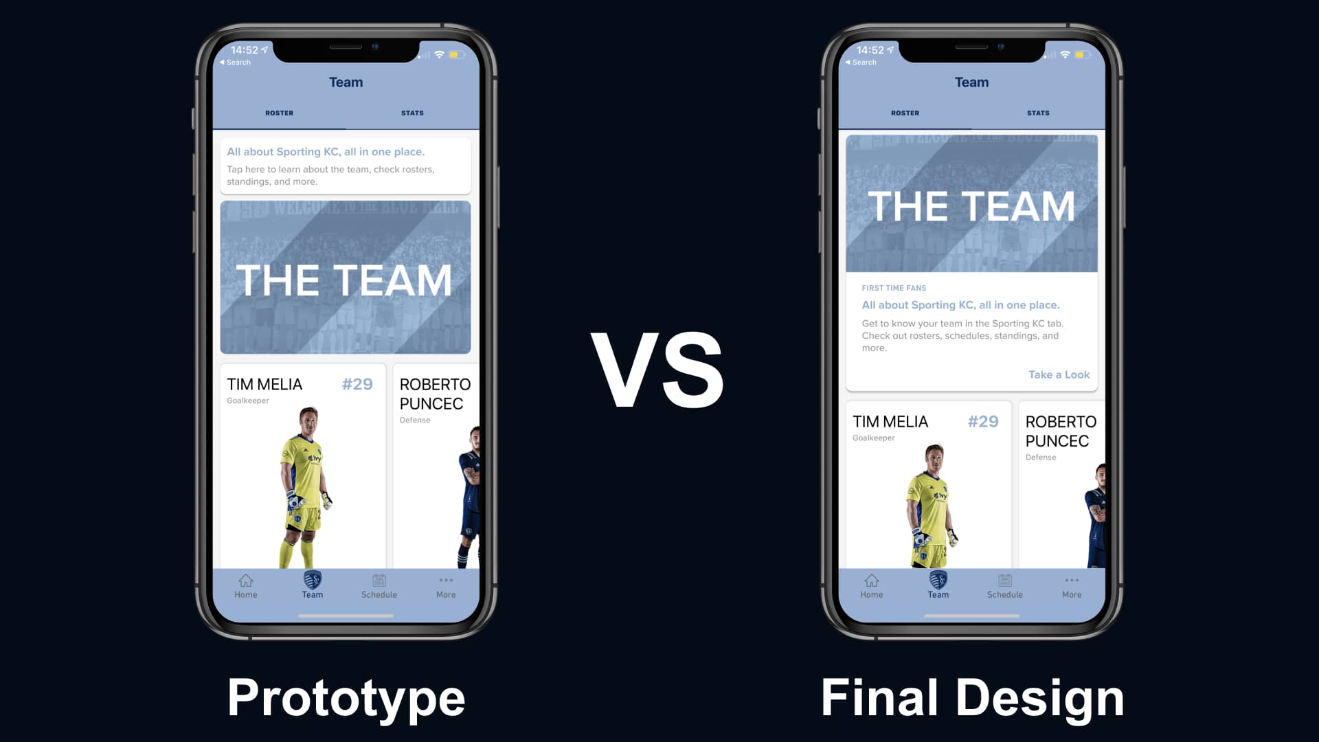
By utilizing the feedback we gathered when testing, we understood what parts of the design needed improvement.
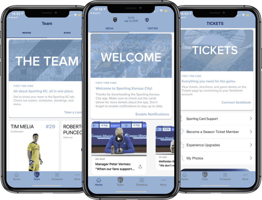
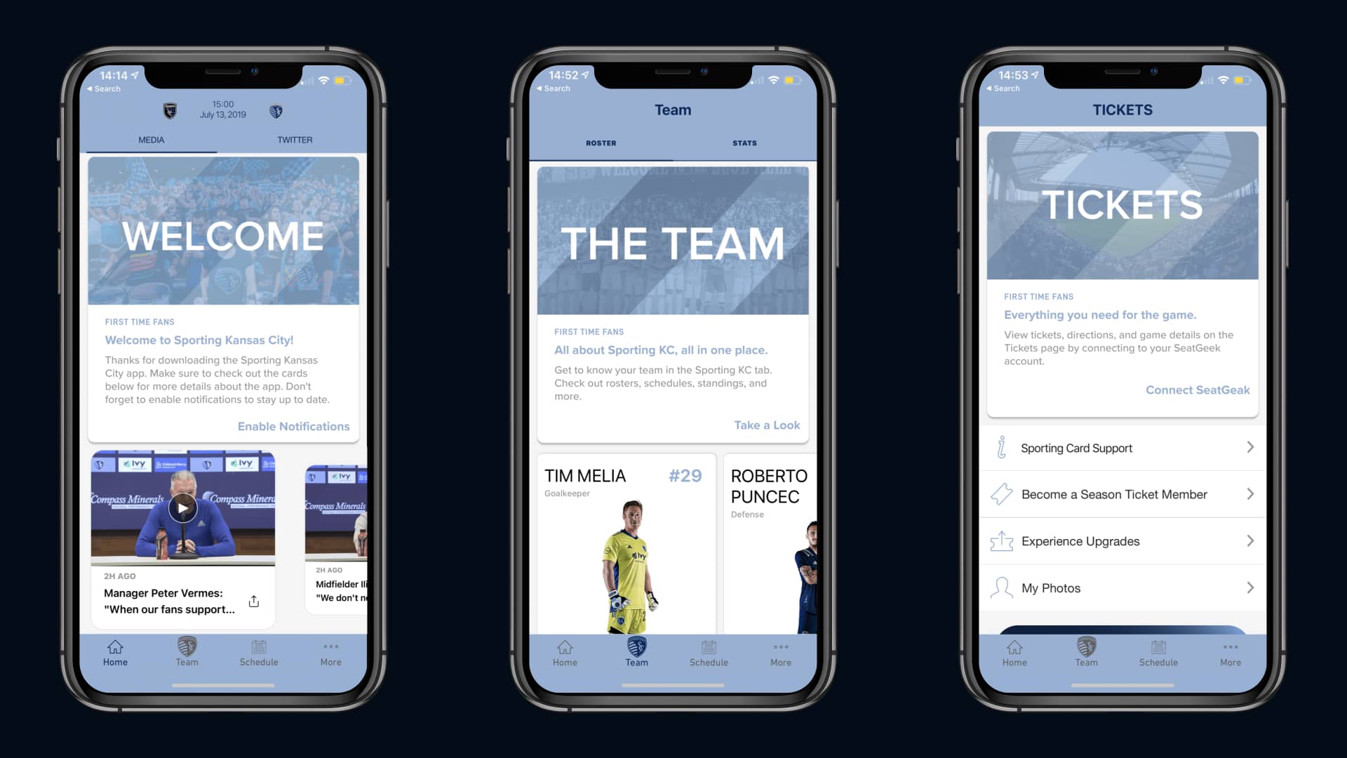
We made the calls to action clearer and added a description for each communication card.
Testing the Final Design
We learned that the new changes helped bring more clarity to each part of the app.
"The text and buttons are much more helpful. I feel like I know what to expect when tapping on each area.”

"As a newer user of this app, I feel relieved that there’s some guidance at the start. I didn’t know what I was doing with the original app.”
The Final Designs
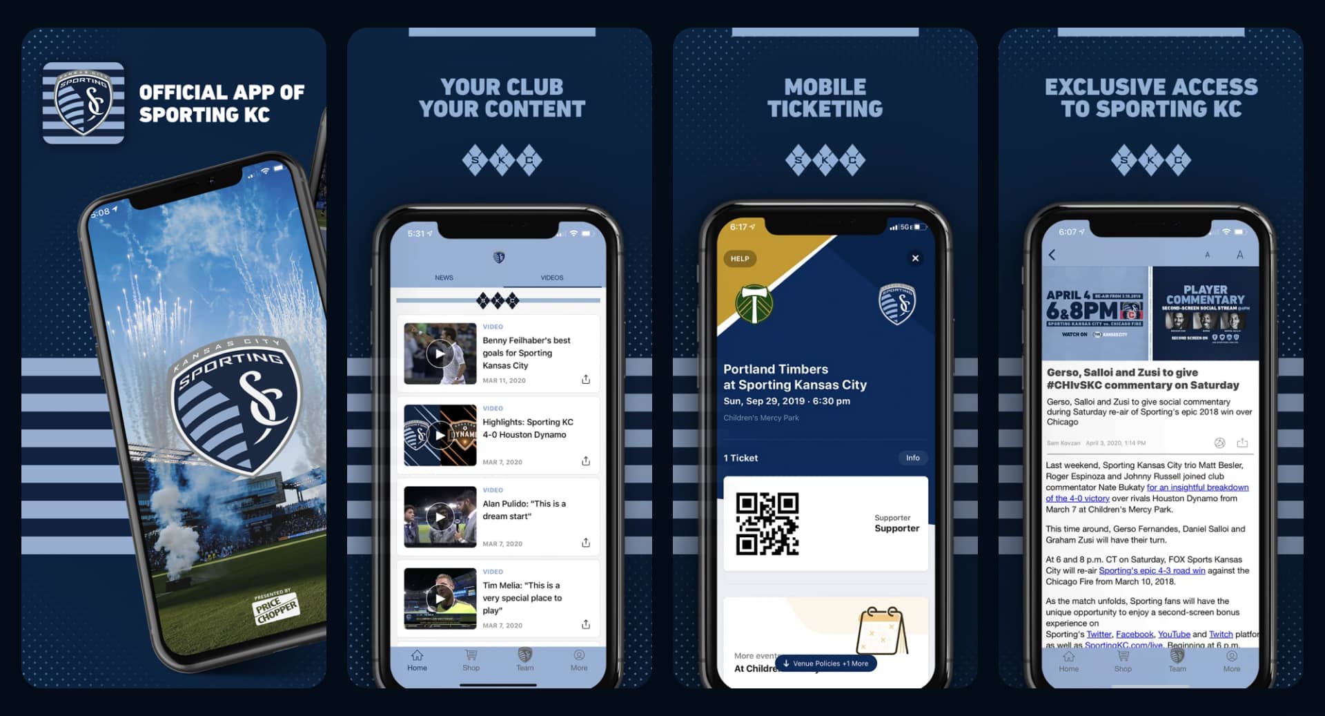
➤ Take a look at the final prototype
Pushing to Staging
5. Reflecting
Looking Back
This project was an incredible experience that was full of firsts.
What I Learned
This ensured that we kept the user in mind each step of the way during the design process.
What I Would Do Differently
Throughout the course of this project, I relied on my understanding of the design processes a bit too much.
While it took me a bit to move forward because of this.
Thanks for Reading!
I appreciate the time you’ve taken to read through my case study to get an understanding of my process. If you have any questions about my time at FanThreeSixty, please reach out! I’d love to discuss it with you!