Resume

Resume

Go back to all projects

Helping Users Breakdown and Tailor Their Day

Creating an innovating to-do app

First Display

~ An Overview

The Problem


There are hundreds of to-do apps focused on helping users complete daily tasks. However, many to-do apps fall short of users' needs, forcing them to either find a new app or download multiple apps to complete their tasks.


62% of users interviewed struggled with their to-do apps. Some users’ would deal with missed notifications while others dealt with a slow approach to creating a to-do. For many users, there was no winning.

To-Do Apps

An overview of popular to-do apps

The Challenge


Jevin Sew and I collaborated to create a tailored solution to help users quickly create to-dos while providing the ability to divide up their day and choose when notifications are sent using the problem statement:


How might we create a to-do app that helps users break down their day using personalized push notifications and settings?


Pausing for Clarity: This was a side project that never shipped.


My Role:

Ideation, research, prototyping, testing, and design of the project.

Our Solution:

We created a to-do app allowing users to tailor their preferences down to the second.


The Result – This is a spoiler! Click or tap here to show the result.


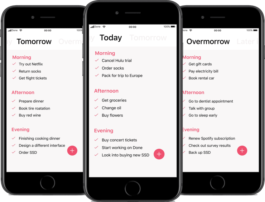
We implemented a day breakdown, providing users with the ability to divide tasks into different parts of the day while tailoring their notifications. This gave users a better understanding of what was coming up during their day while helping them stay on top of it.


      Take a look at the final prototype.


1.   Researching the Problem

Secondary Research


Jevin and I began the project with secondary research focusing on a few different to-do apps to find where users were struggling. This helped us understand what we could do in our app to provide users with solutions to their pain points.


We learned that users were struggling in two key areas:

  • Push notifications: Users continually missed push notifications about their daily tasks causing them to fall behind.
  • Day organization: Users wanted the opportunity to divide their day into sections. However, many apps removed this feature or did not have it.
App Reviews

Reviews of two different to-do apps on the App Store

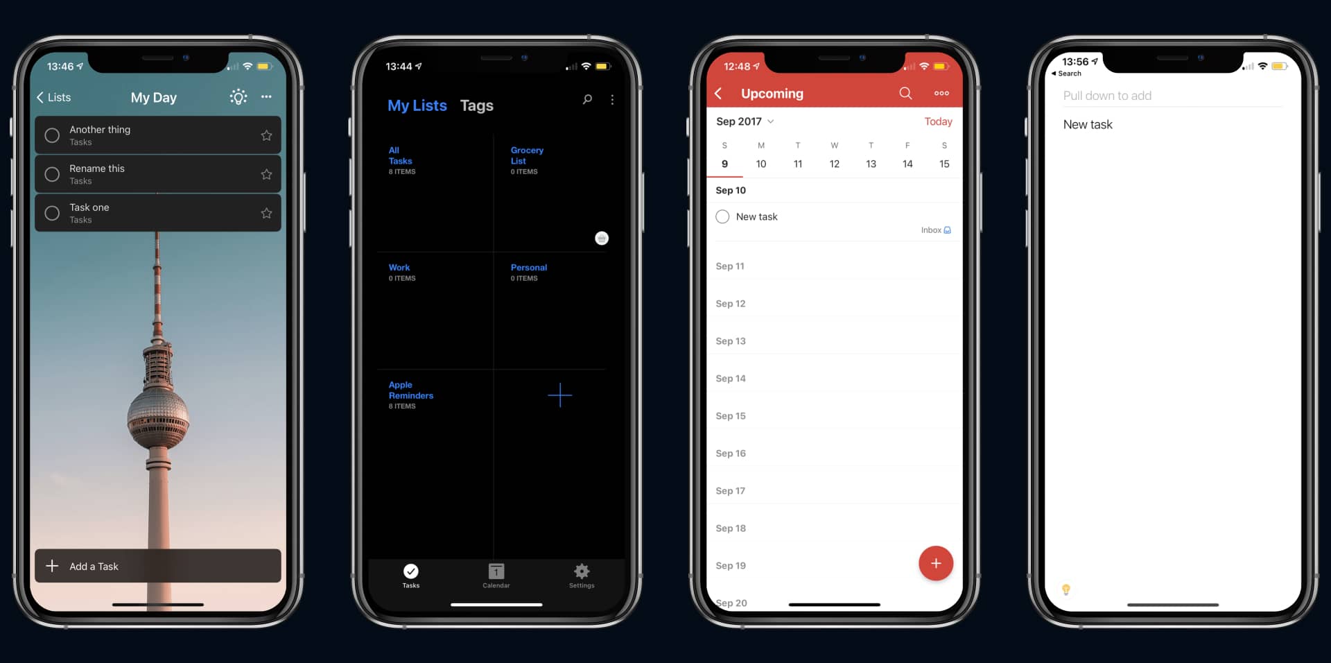
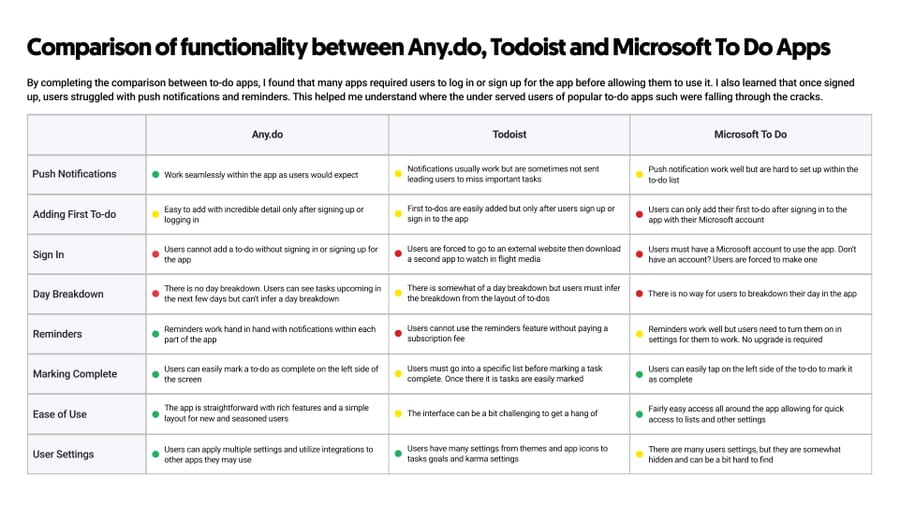
A Competitive Analysis


To get a better understanding of what users were missing, I completed a competitive analysis of popular to-do apps. This helped me understand where the under served users of popular to-do apps such as Todoist or Any.do were falling through the cracks.

Competitive Analysis

Competitive Analysis of popular to-do apps Any.do, Todoist & Microsoft To Do

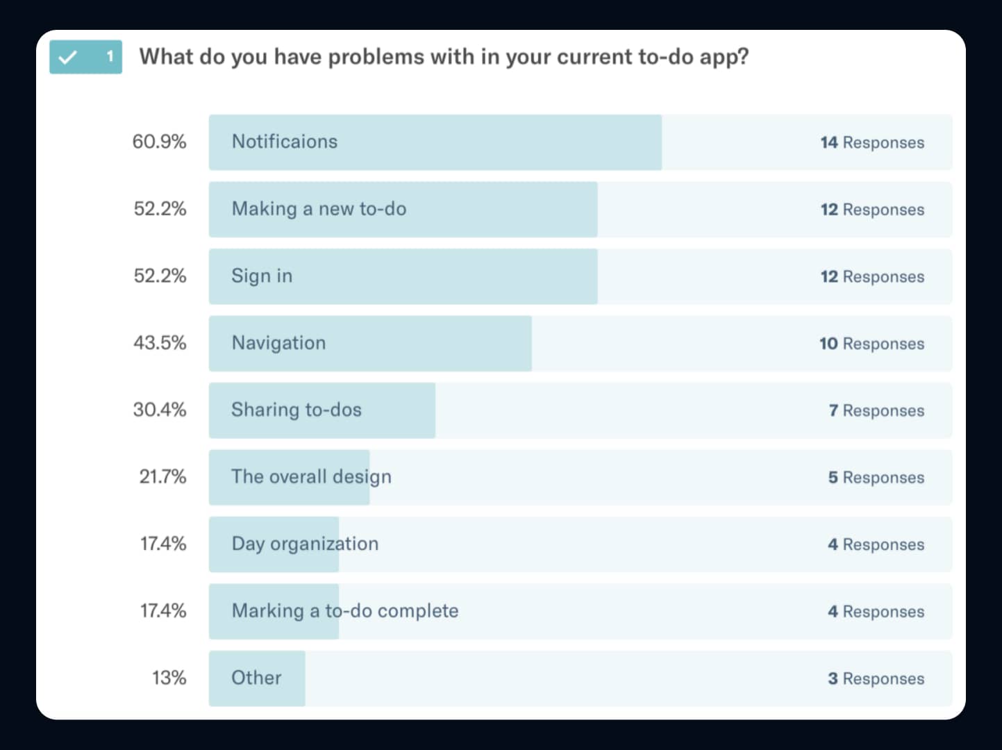
Understanding User’s Needs


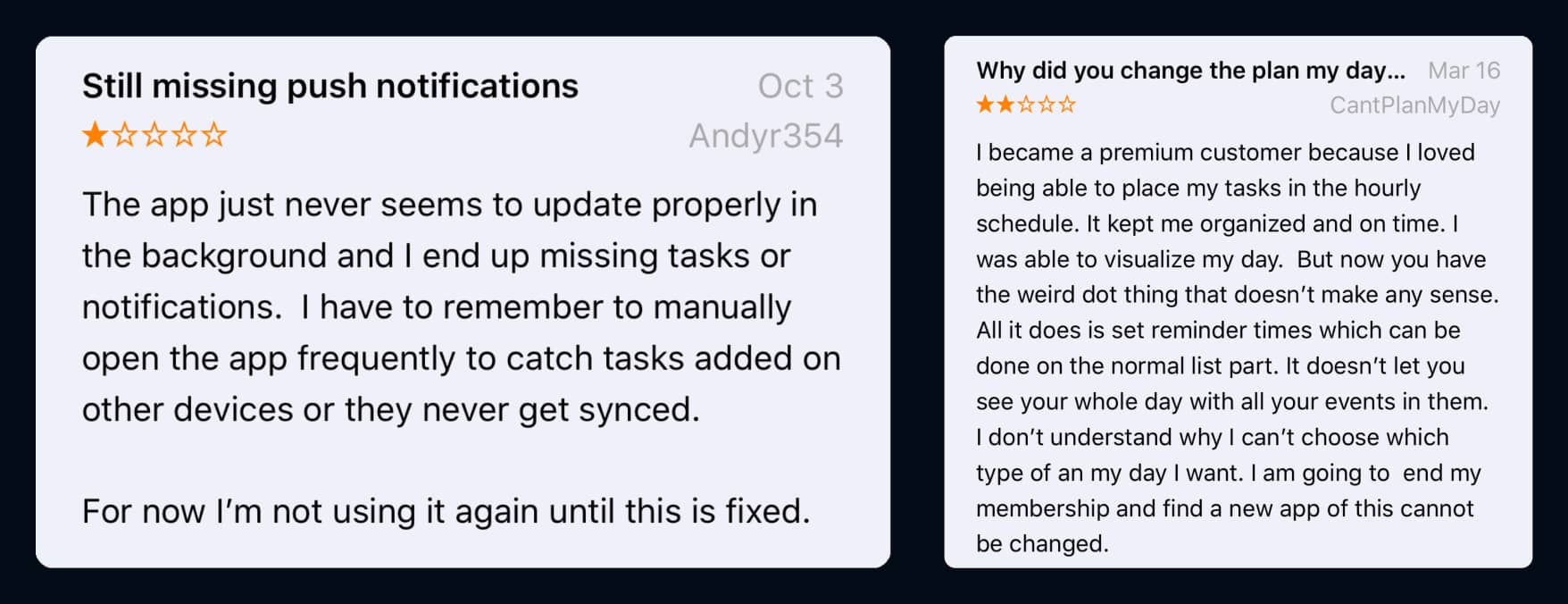
Diving deeper into the research, I reached out to multiple users of to-do apps on Twitter to better understand the needs of those who were falling through the cracks. This brought to light how many users struggled with the apps and what they needed from a to-do app.


From this I learned:

  • Multiple users were missing notifications and wanted a more tailored approach.
  • It was a struggle for users to create a to-do as many apps forced a sign-up or sign-in before a to-do could be created.

“I purchased premium because I loved placing my tasks in the hourly schedule. It kept me organized and on time.”


This helped Jevin and I focus on a major pain point: Users struggled to find a to-do app that could allow them to personalize and breakdown their to-dos based on parts of the day.


2.   Ideation

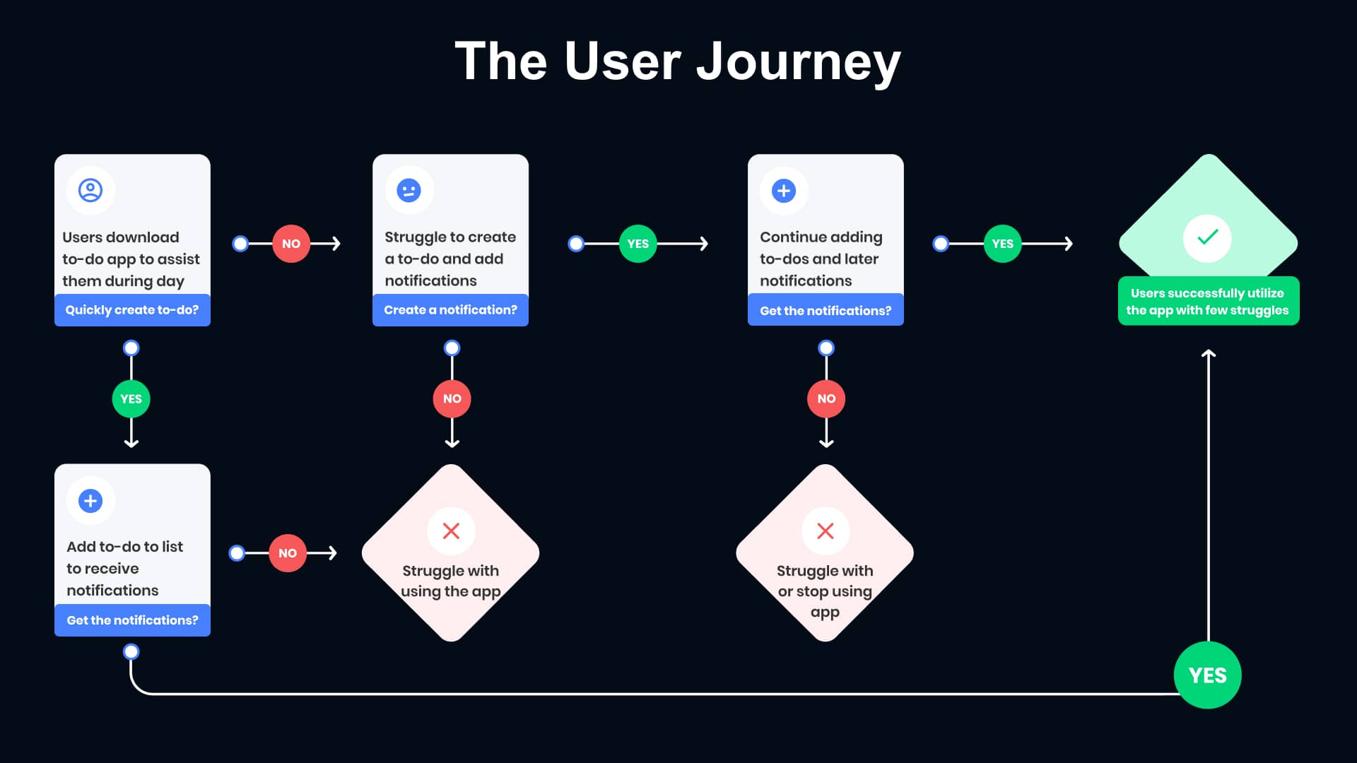
Dissecting the User Journey


We took a look at the current user journey from popular to-do apps to pinpoint where users were struggling to create and personalize a new to-do.


As you can see below,
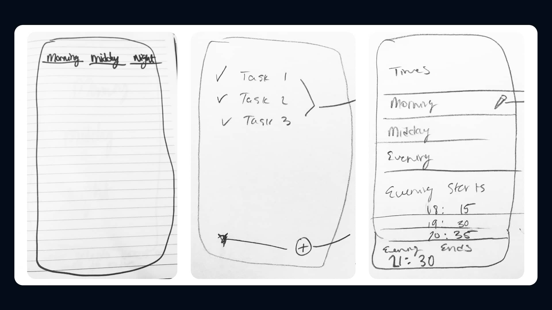
 it was a challenge for users to create and customize their to-dos because of the multiple steps when adding a single to-do to the list.

User Journey

The User Journey of most popular to-do apps

Sketches


We drew up a few sketches of what the interface may look like to help users easily create customized to-dos. This helped us visualize our design decisions before wireframing and testing.

Sketches

Initial sketches of Done's interface

Wireframing


Once we had a key idea of the user’s needs and the interface, I created a few wireframes. This helped us iterate on the options for users while hashing out the look of the prototype for testing.

First Wireframe

Wireframes for Done's interface

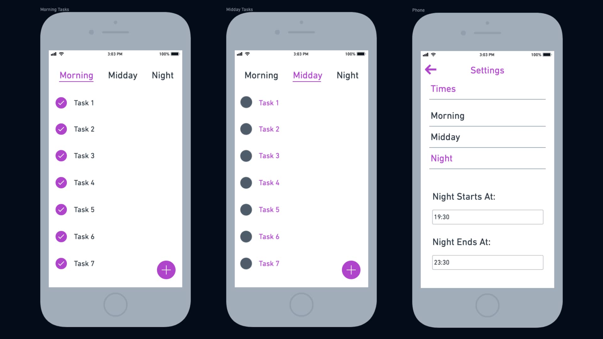
3.   Prototyping & Testing

Designing the Prototype


Using the sketches and wireframes, I designed the initial prototype for testing. I used Sketch to design and prototype because of the ease of sharing the project files across oceans with Jevin.

Initial Prototype

The initial prototype for Done

Interviewing & Testing with Users


We tested the prototype with the users we interviewed to understand how the app could help them perfectly create and be reminded of their to-dos.


Testing helped us improve the prototype’s initial design and gather unbiased feedback from each user we tested with. I received the following feedback from users:


Tristan

"The top of the app feels incredibly cluttered. I'm more overwhelmed and confused by this than I've been in any other to-do apps."


Toby

“I’m really not sure how to switch between the days. Am I supposed to swipe or tap? I don’t understand and wish it was clearer.”


4.   The Final Design

Redesigning from Feedback


From the feedback and quotes when testing the prototype, we knew that the design needed work. We understood what helped the users and what hindered their experience, which helped us easily refine the design.


We made the top of the app clearer to provide users with a better understanding of how to switch from day to day. Our goals were to provide users with visual cues helping them move through the app faster.

First Prototype

The first prototype screen versus the final design
Seconds Prototype

The second prototype screen versus the final design

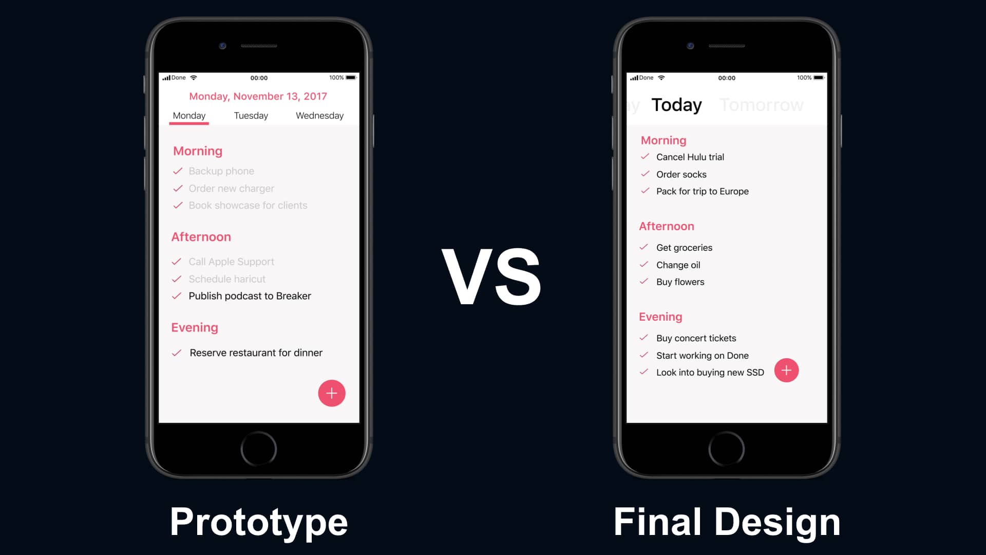
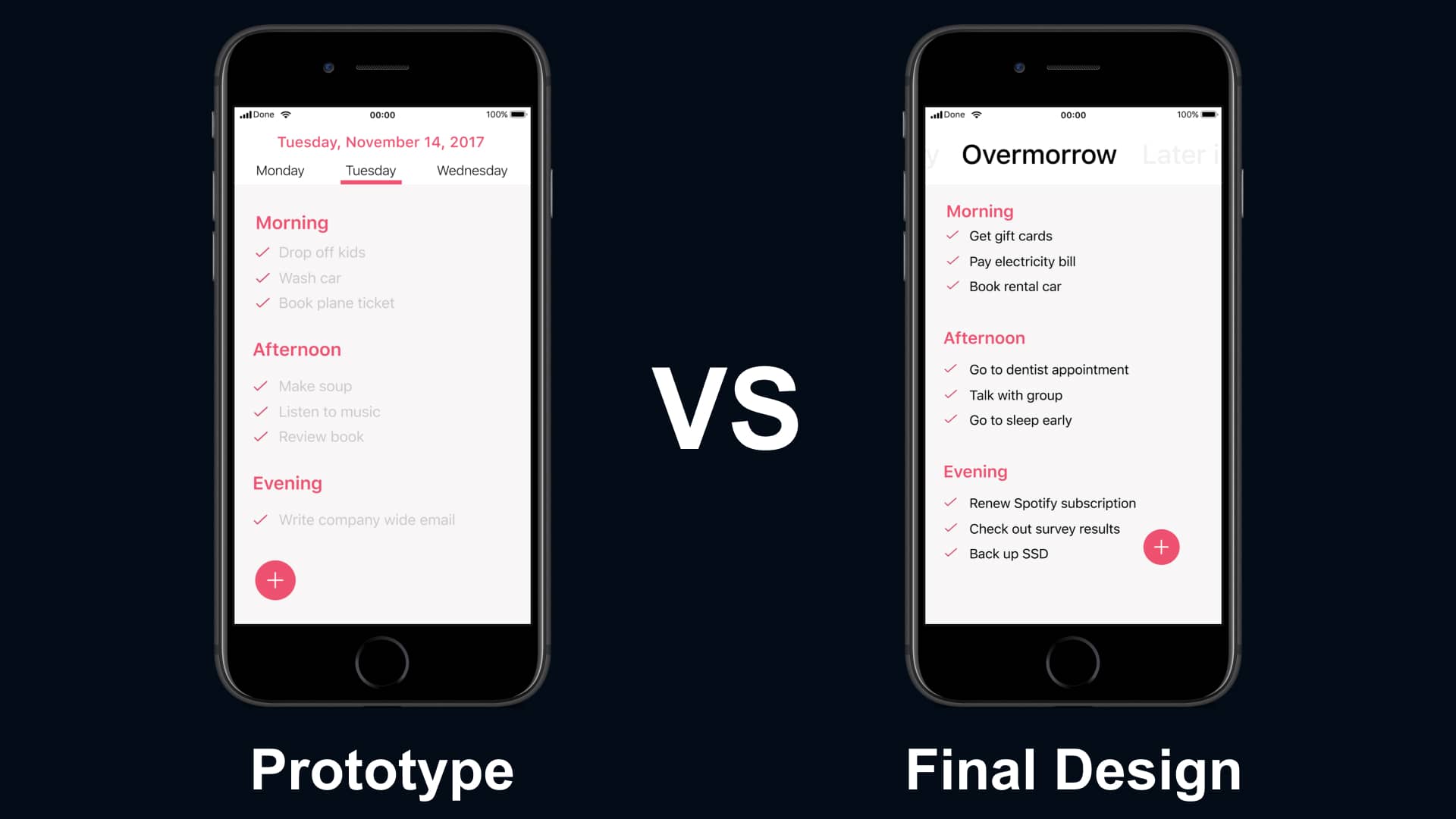
Testing the Final Design


We tested the changes with the same users and learned that the new design helped them quickly and easily add tailored to-dos within the app.


Users could easily move from day to day, creating new to-dos that were allotted to each part of the day. This helped them easily tailor a to-do with persistent notifications before selecting what part of the day it belonged to.

Final Design from Testing

All screens of the final design
Tristan

"I actually understand where each part of the app is and what I need to do to add something to it. I like this a lot!”


Toby

“The switching is much easier, and I love that it lets me break down the days into times so I can be on top of my day.”
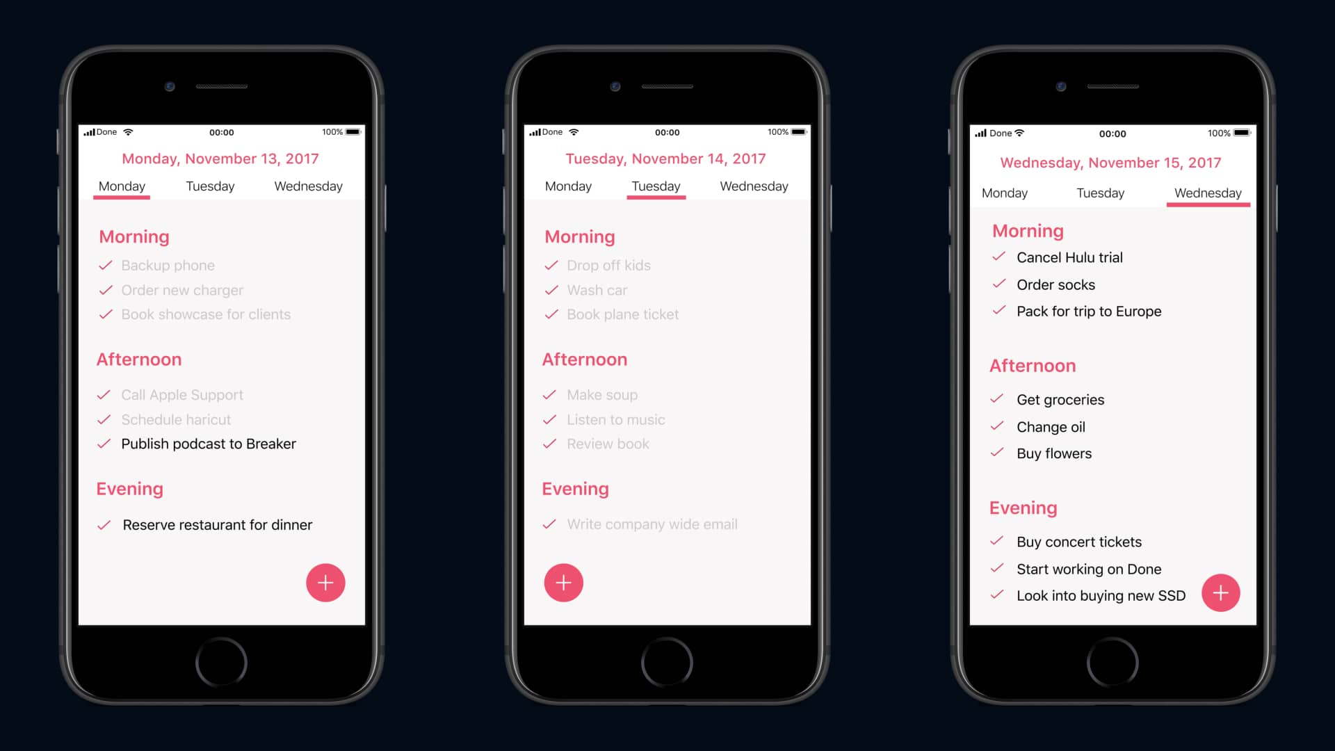
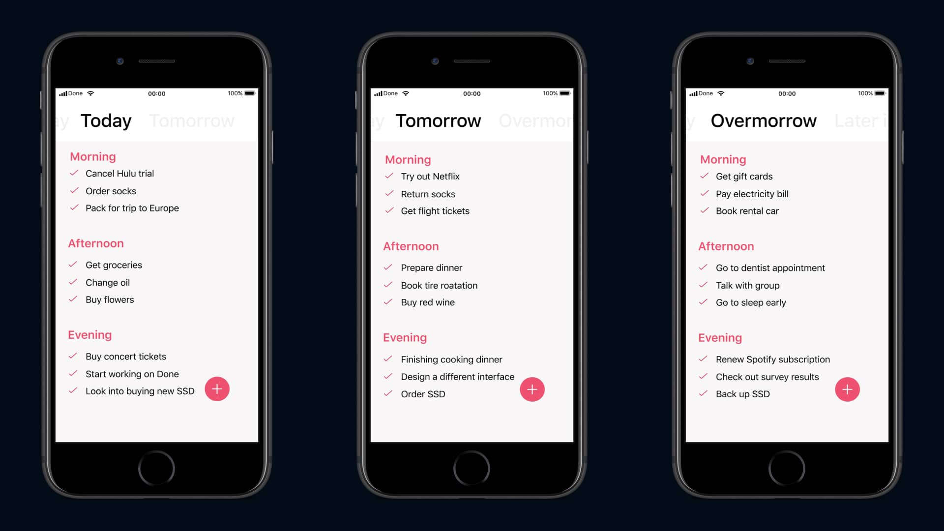
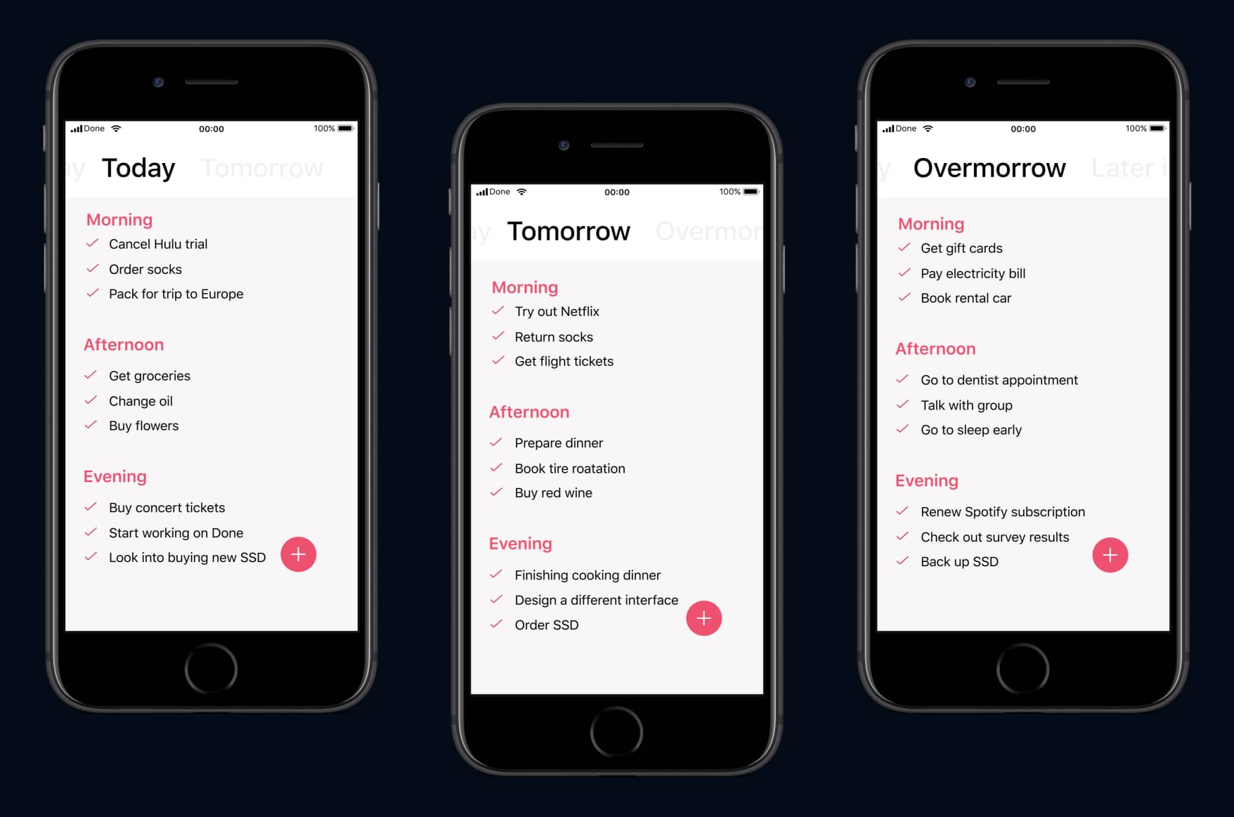

The Final Designs


We prototyped an example use case to share with users who were interested in testing the app. Unfortunately, Done was never published to the App Store.


      Take a look at the final prototype.


Final Design

The final design making it easier for users to switch between and breakdown their day

5.   Reflecting

Looking Back


This was my first time working on a side project with a developer that I knew.
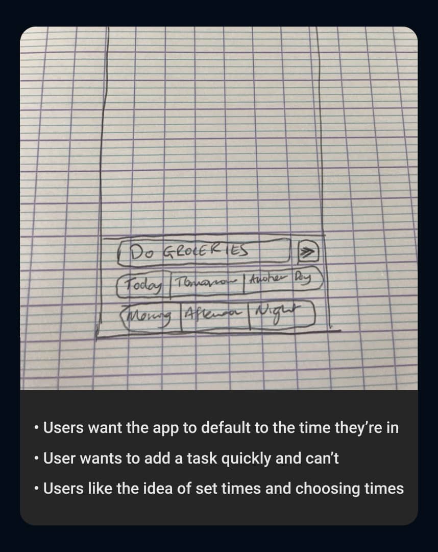
 While we were able to create a working prototype and beta version of the app, I struggled to translate my designs to Jevin which led to struggles along the way.

Notes

An example of my vague notes shared with Jevin

What I Learned


Communication is key. When discussing designs with Jevin, I wasn’t aware that there were limitations in the development. This led to me redesigning multiple parts of the app, resulting in poorer quality and less focus on the user’s needs.


With a better understanding of the limitations, I could have saved both Jevin and I time and stress. Since this project I know more about the limitations and understand what is possible during development.

Coding

A visual of understanding development limitations

What I Would Do Differently


If I were to do this project again, I would ensure that we had a defined audience for interviewing and testing. With the multiple audiences we had, it caused us to test slowly and receive some questionable feedback.


Since this project, I ensure that I understand who my target audience is and that the feedback received makes sense.

Surveys

An example of the feedback we received

Thanks for Reading!

I appreciate the time you’ve taken to read through my case study and get an understanding of my process. If you have any questions about Done, please reach out! I’d love to discuss it with you!


Back to All Projects